Hey, everyone. WaterGirl here with an update on the site rebuild.
I’ll start with a tiny bit of information about the process. The kickoff meeting with the web developers was just over a week ago on Friday, May 3, and we started the design phase on Monday. The design phase lasts no more than 2 weeks, so it’s a whirlwind! In that time, we decide on all the features and functionality, as well as the look and the overall design, right down to the choice of fonts and exactly where everything will be and what it will look like. The actual programming starts right after that.
So we are in the design phase for just a few more days. Once the programming begins, there’s not a lot of room for adding functionality or changing the look, the fonts, the overall design, or anything, really. So your chance to share your thoughts in a way that could influence the outcome is right now, over the next few days, not once the site goes live.
Maybe you’ll want to know a bit about where we’re coming from? On other political blogs, there has never been a site redesign or site overhaul that I have liked; I always feel like they’ve ruined the blog. So the main goal here was to not do that. First on our spec list to potential developers:
“We don’t want a new DESIGN. We want better functionality. Our primary goal: a speedy, responsive, reliable, aesthetically pleasing site with a reliable commenting system that works consistently, and well — on mobile devices and desktops — with the features outlined in this document.”
What we’re going for here is streamlined and zippy, not flashy with a lot of bells and whistles. We still want it to feel like home, and we’re kind of excited about how it is shaping up. Now we get to find out whether you guys feel that way, too.
So jump in and tell us what you really think, and don’t worry about hurting anyone’s feelings. Oh, wait, this is Balloon Juice, never mind, I’m pretty sure that last part goes without saying. If you prefer to share your thoughts privately, you can send email to BJfestivus at that google mail place. Whichever way you share your thoughts, I promise we will read every word. Scratch that. I can’t speak for John, but I promise I will read every word.
You never want to give up functionality in an upgrade unless there’s a darn good reason, and we’ve tried to stay true to that. So, for example, you’ll still be able to contact a front pager, but you’ll do it in a different way. We are going with email hosting using the balloon-juice.com domain, so instead of a contact form you’ll send email to directly to a front pager using their name. If their name is Humpty Dumpty, you’ll add a dash between the two parts of the name. (Each front pager can choose whether to keep their front pager email separate or to forward it to another account with their personal mail.)
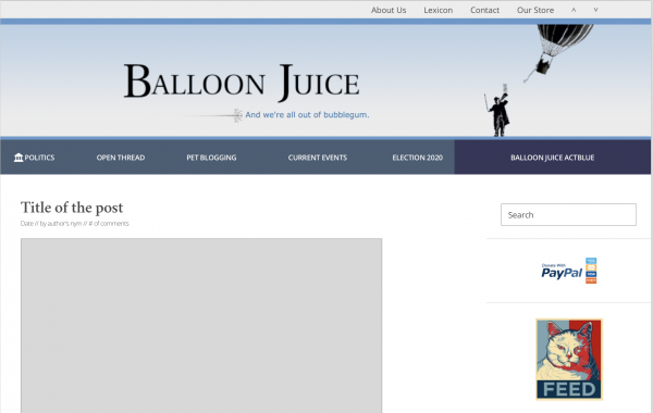
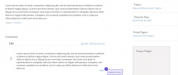
You’ll see that Quick Links is gone, but there’s a floating bar and a category bar and some links that perform the same functions. So take a look and let us know what you think, but please understand that things are moving quickly and there have already been some changes that aren’t reflected in the mockup posted here, such as the reply button, which will always show for each comment even though the mockup indicates that it will only show up if you hover on a comment. And you’ll see that the checkbox to save your nym is on there, but not to worry, nyms etc will be permanent again and the little checkbox will be gone in the next mockup. If we waited to show you the mockup until it’s perfect, we would lose the window for your input.
I’ll be back at 6pm Eastern time to answer any questions or comments that come in then, or that came in during my afternoon siesta.
Villago Delenda Est
Looks good!
As for fonts, well, comic sans is right out!
Dorothy A. Winsor
It looks good to me. So why do I feel this sense of panic? I hate change.
Jerzy Russian
Is there some way to have larger fonts for the mobile version, especially in the comments?
Mike S (Now with a Democratic Congressperson!)
I like it. Looks like the old, but better! Thanks for the work.
Shantanu Saha
If John can guarantee that Lily and Thurston will be regular commenters, I’m okay with all of it.
Betty Cracker
Where is my listing under “Featured Content”? It’s supposed to say: Betty Cracker | Angry Wine Mom Vituperation*
*Kidding, in case that’s not obvious. You never know around here!
stinger
If this is a commitment that Lily and Thurston will be active commenters, I’m good with that!
ETA: And Shantanu Saha beat me to it!
Mr. Mack
Don’t forget to add a feature (any feature, really) for us lurkers.
Gin & Tonic
I’m probably missing it, since you don’t have enough comments in the mockup to show this, but they’ll be threaded, right?
Major Major Major Major
I know that some valued readers don’t allow JavaScript, so make sure it works adequately for them too!
shaun
Please please don’t pull a Booman, truly one of the great redesign bait-and-switches in intertube history. We love you!
Gin & Tonic
But props for bringing the balloon man back.
dnfree
That looks…..impressive! And functional. I did not know that Lily and Thurston could speak (or at least write) Latin.
TaMara (HFG)
@Betty Cracker: Right? I want, TaMara (HFG) – Your Blog’s Cruise Director
WaterGirl
@Gin & Tonic: Ha!
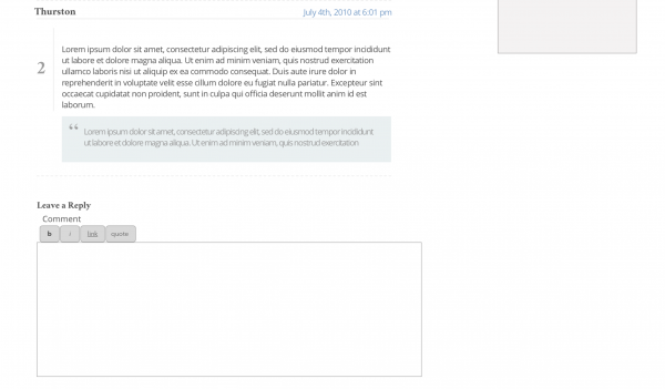
The developers made their case for threaded comments. Twice, in fact. But I made it perfectly clear – no threaded comments.
BeautifulPlumage
Looks cleaner. Will ads still be in the same places: above the banner, between posts, and in the side bar?
OT: the ads I get on this site are usually hard-right push poll click bait and sports shit. I don’t go to the faux news sites or blogs, so not really sure why that’s what the AI thinks I want. I also don’t sign into the Chrome browser or set preferences there. Is my phone infected?
SiubhanDuinne
@shaun:
No kidding. It’s awful now.
As for Balloon Juice, it sounds as though the team is doing things right.
And I’m thrilled that “Balloon Man” is back!
Davebo
Can we go back to blog roll links opening in a new tab?
Baud
Too late for that.
Major Major Major Major
@BeautifulPlumage: we have ads?
Mnemosyne
@Jerzy Russian:
Seconded. Remember that many of us who read on mobile are middle-aged and can’t read tiny letters.
At this point, the site has gotten bad enough on my aging iPad that I will welcome almost anything that saves my nym and doesn’t randomly reload the page while I’m in the middle of typing a comment, when it loads the page at all.
WaterGirl
@BeautifulPlumage: The thinking going forward is to have fewer and smarter ads, and no autoplay ads — enough to pay for the blog and web hosting, which is not cheap — but not so many ads that the site is essentially unusable, as it has been for many of us. The proof will be in the pudding, but that’s the plan.
The conversations about ad placement will begin once we move out of the design phase into the building phase, but I know from the developer selection phase that our web developers do not care for top banner ads. Yay!
Their philosophy is that you can get better results with say, just one ad per page, than with a million. No auto-play ads.
stinger
Layout: I like the design tip to toe — banner to pie filter! Clean and clearly organized. Thank you so much for not ruining it with that ghastly chock-a-block layout everyone seems to be going to.
Content: Nice to see the categories identified for the right column. I’d love it if On the Road could be one of the tabs or a Featured Content link.
Omnes Omnibus
I want to thank everyone who is selflessly subjecting themselves to the pile of abuse that will be forthcoming. I am on my phone at my parents’ house, so I will wait until I get home and have a chance to really look at the new stuff before I start complaining.
Ohio Mom
@Mnemosyne: Another set of old eyes here. Still looking for a pair of readers that work.
The mock-up hardly looks different at all, which is the highest compliment I can think of. Continue apace!
Yutsano
I’m going to treat this like every Doctor who sees a new TARDIS:
“You’ve redecorated! I don’t like it!”
Baud
What will appear on hover?
WaterGirl
@Davebo: The blog roll is something that Cole did not want to keep in the new design. Either the blog roll is so big that it no longer serves its purpose or it’s out of date, and we end up with the same result.
Is that something that will be missed?
CaseyL
Looks terrific! “Like the old, but better” is an excellent plan, and it looks like you did it.
Also happy to see Balloon Man again :)
zhena gogolia
Glad to see Balloon Man back.
Just don’t give us Purple People-Eater avatars.
Omnes Omnibus
@WaterGirl: No, I at least will be just fine without it.
Mary G
I like having a link to Balloon Juice ActBlue right up front like that.
WaterGirl
@Jerzy Russian: @Mnemosyne: re: font size on mobile devices.
There is one site design, and that gets ported to mobile devices and scales automatically. I assume that will be done appropriately, and I have mentioned several times that we don’t have a lot of 20-year old eyes on this site and that things have to be readable.
We will have the same functionality on desktops and mobile devices, but where you find that functionality will differ between desktop and mobile. For instance, items that are in the floating bar at the very top will be accessed with the 3 lines at the top on a mobile device.
jeffreyw
If that is going to be a “sticky” bar, a thing that stays visible while scrolling, I say kill it with fire.
Kill Sticky!
Dorothy A. Winsor
@WaterGirl: Thank you! I like the zigging and zagging conversations we have.
Also I like having “recent comments” back. That’s how I kept track of where people were posting.
Baud
@WaterGirl:
People really shouldn’t be getting out of the boat.
Hungry Joe
When it rolls out, I’m sure that over the course of about a week I’ll march through the same set of reactions I always do:
1) What IS this? I hate it.
2) Okay, I’m getting used to it.
3) It’s always looked like this, right?
?BillinGlendaleCA
@Omnes Omnibus: Great News Omnes, there are threaded comments.
WaterGirl
We will be doing serious testing before rollout, so if there is an issue with size on mobile devices — which I don’t expect — it will be dealt with the before the rollout.
We will have another thread in the next day or two where I will ask for volunteers for *testing. More on that later, but we hope to have testers who have more than one device — or use more than one browser — so each tester can compare what things look like in different environments.
* No jackals will be harmed in the testing.
Ian R
@jeffreyw: Strongly agree. Sticky/floating bars always stay right where my eyes want to be focused while reading. It’s infuriating!
Baud
@Dorothy A. Winsor:
Agreed on both.
Mnemosyne
@WaterGirl:
If we can keep some form of M^4’s add-on scroll buttons, that would be ideal. Long comment thread + reading on a phone = a giant PITA trying to check for new comments at the end of the thread.
?BillinGlendaleCA
@Baud: We gonna need a bigger boat.
WaterGirl
@Baud:
Subliminal text that says “We love you, Baud!” but it will come and go so quickly that you will never see in with the naked eye, but you will come away feeling refreshed and happy.
JaySinWA
@WaterGirl: I am Balloon Juice, your blog, you shall have no other blogs before me.
Omnes Omnibus
@?BillinGlendaleCA: Should I start precomplaining?
geg6
Balloon Man! As long as he’s here, I’m fine.
That said, no Lexicon?
Sebastian
Sooooo, no threaded comments?
I think I need to tell the blogmaster via email to implement this feature. Lemme turn on ALL CAPS. Be right back folks.
Baud
@WaterGirl:
It’s about time.
WaterGirl
@zhena gogolia: The developers offered the option of having avatars, and I think there is a very good chance that I actually snorted with laughter before I mentioned the Avatar Sunday that will live forever in our memories. (I didn’t even tell Cole that they offered avatars as an option, so please don’t tell him.)
Cole isn’t even keeping his blue-colored comments in the site rebuild because he wants everyone to be on equal footing in the comments.
karen marie
I am a happy camper – everything I use is staying the same, and the “save your info” thingy is promised to be fixed. As for the font size – if I am on my tablet I can make it bigger by touching w two fingers and pull out, so it’s not ever an issue for me. I will look later from my laptop but I don’t expect any complaints will come up.
I will miss the tags. Even though I never look at the aggregated content through them, they often make me laugh.
?BillinGlendaleCA
@Mnemosyne: Good point.
Baud
@WaterGirl:
When did Cole become a commie?
?BillinGlendaleCA
@Omnes Omnibus: Of course, it’s Balloon Juice.
Davebo
@WaterGirl:
Not by myself really. It’s demise may be a savior as I’ll no longer be temped to see that GGreenwald is spouting today.
?BillinGlendaleCA
@Baud: 2006 or 2007.
WaterGirl
@Mary G:
Thanks for bringing that up!
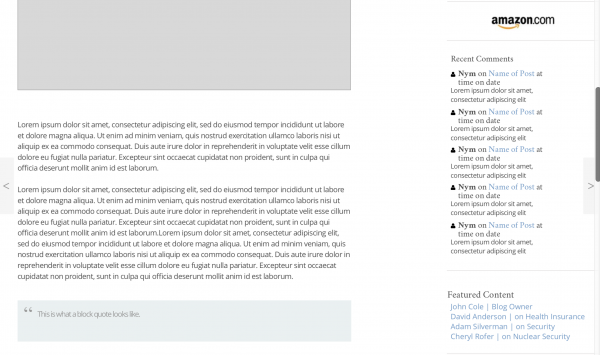
That one area on the right is something that will change according to what’s happening. If we’re doing the BJ calendar, that will open in a new tab that provides all the information about deadlines, how to send in your photos, how to order the calendar, etc.
If we had had this feature last year, we would have put Leto’s GoFundMe up there. At hot election times, we’ll have the BJ Act Blue link.
How do you guys feel about that?
karen marie
@WaterGirl: That’s kind of too bad. I like our host’s comments being highlighted. They’re so rare, I am afraid I will miss seeing them.
?BillinGlendaleCA
@WaterGirl:
The colored comments for Cole were nice, you could always tell when got of the Twitter machine and grace us with his presence.
WaterGirl
@jeffreyw: uh oh.
karen marie
@WaterGirl: Excellent.
WaterGirl
@Baud: Why not?
WaterGirl
@Mnemosyne:
That’s what the up and down arrows are for in the floating bar at the top.
Right now, you should be able to see the “previous post” and “next post” arrows on the side. Yes?
debbie
I like the cleanness of the design. I worry about serif headlines and how they render on different devices. Could the text font be a skosh larger? Will one have access to all threads or will we have to click on each category in the bar up top to see what all is going on?
germy
@WaterGirl:
Thank you WaterGirl and everyone for the work you’re doing on this blog. I appreciate this place.
trollhattan
Speed and stability are their own rewards and I’m wholly in favor of all improvements there. As to the clean and simple mockup, I’ll only note that with the dominance of 16:9 and even wider aspect-ratio monitors and diplays, be very stingy with banner height because Y-axis real estate is precious.
Carry on!
JaySinWA
You do remember you promised that refreshing the page would bring you back to the last comment you were on, not some random location based on how many images or tweets were in the post? Speaking of tweets and images, does commenter equality address the ability of front pagers to do magic in their comments while us plebs can’t?
randy khan
The willow is too close to the front page.
Seriously, it looks pretty good. I like clean designs.
WaterGirl
@geg6:
Of course we have the Lexicon. Look at the floating bar at the top:
About Us
Lexicon
Contact
Our Store
Up arrow
Down arrow
Baud
@?BillinGlendaleCA: So BJ is like a collective?
@WaterGirl:
It’s scary out there, and there are strange ideas.
Raven
We’re a couple hours from home and are both whipped!
debbie
@germy:
Yes, I forgot to thank everyone who has been involved with this. It can’t be easy.
Major Major Major Major
@WaterGirl: floating bars take up valuable real estate on mobile layouts; combined with some people’s large text settings it can make sites pretty hard to use. If you’re considering hiding the top bar on mobile then you’d need a different place for the arrows, which are really more of a mobile feature anyway.
debbie
@Raven:
Sick of fish yet? ;)
joel hanes
You’re doing fine work. Thanks.
Is the funding still adequate, or do we need to donate again to fairly compensate the team for this professional effort ?
SRW1
After the re-vamp this blog is gonna climb into the top 5,000 fer sure. Just kidding, godspeed to all blog workers!
?BillinGlendaleCA
@trollhattan:
They said there’d be no math.
WaterGirl
@karen marie:
Thanks for mentioning this. In the olden days when we had two options for mobile devices (desktop version and mobile version) you could only spread your fingers to make text bigger if you had selected the desktop version for your mobile device. If you chose the mobile version, you couldn’t do the finger spreading thing.
When the (then potential) developers first said they use a single design so using the desktop version on a mobile device would not be an option, I was slightly horrified until I asked if we would be able to do the finger spreading thing on mobile devices and they said “of course”.
Luthe
@geg6: The Lexicon is in the menu bar at the very top between “About Us” and “Contact.”
I’m not in favor of anything that only appears on hover, as that’s the sort of thing that’s impossible to idiot-proof and will quickly lead to grief.
Baud
We should have a captcha to keep the bots out.
Another Scott
Looks good. Thanks for your efforts on this.
I think we’ve discussed the following before, but I don’t recall the status:
How much HTML will we be able to include? Has anything changed there? (E.g. snark font?)
Comment Preview?
How many links per post? Has that changed (from, what is it now, 5?)?
On the mobile site, will we have the left/right Previous/Next Post flyout buttons? (I don’t see them on Android – maybe there’s not an easy way to do that since it’s not easy to hover a finger over a button.) If flyout buttons can’t be done, can you add L/R buttons along with the existing 4 arrow buttons? On the mobile site, will we have a Refresh button (it’s a pain to have to scroll back up to the top to refresh the page looking for new posts/comments) along with the existing 4 arrow buttons?
On the L/R flyout buttons, is there any way to (somehow) have a counter to indicate whether there are new replies without having to actually click on it and see the page (e.g. some reply counter that is updated and displayed without having to refresh and display the page)? It might take some load of the database and reduce data consumption for those paying for data on their phones. (There must be some way to do it as Twitter updates their new post counter without refreshing the whole page.)
Thanks again!
Cheers,
Scott.
JaySinWA
@trollhattan: I don’t usually look at general web stuff on my phone, but when I do, it is usually in portrait mode not landscape. It’s more comfortable for me to hold that way. I’ll flip it if I need to see landscape photos, otherwise it’s y-axis is longer than x
WaterGirl
@karen marie:
I think you might be thinking of the CATEGORIES, not TAGS. A few years ago Cole had a rant about the fucking tags which I feel certain included the words “god dammit!” where he decreed that front pagers should stop using tags. So most of them did stop using them, but Adam and Cheryl started posting long after that so they never got the memo.
Judging by the tags that were currently in use, it seems like they have mostly fallen out of use by the front pagers who were here for the rant.
We had 2,025 tags (!) and my favorites were the 67 tags that someone had taken the time to create, but were never used! :-)
As I deleted the tags, I will confess that the only one that was truly difficult to delete was the “We’ll Do it Live!” tag. The only reason I was able to see well enough to delete that through the tears in my eyes was that it hadn’t been named “Fuck it, We’ll Do it Live!”.
Categories are staying, but they will be greatly reduced from the 400 we have now.
Silvery
@Major Major Major Major: I really like the arrows, and mostly use them on my mobile devices as you say. It’s a feature that would be greatly missed. Overall I’m very excited about the new build, looks great!
WaterGirl
@karen marie: If you all start picketing for the return of Cole’s blue comments, I’m sure Cole would take it under advisement.
That’s what this feedback opportunity is for — if you miss something that’s gone or desperately want something to be added, this is your moment to speak up.
geg6
@WaterGirl:
Ah, thanks! Did not see that.
I now pronounce myself perfectly happy.
Baud
I’m on a limited data plan, so anything that reduces the size of a web page would be appreciated.
WaterGirl
@trollhattan: Good point about the banner size. That has been discussed with the developers and the banner is staying, but we’ll see what it looks like on phones once the site is in actual development.
trollhattan
@JaySinWA:
Admit I use the desktop and not mobile site when looking with my phone. Hopefully the new mobile site design will be robust enough to end that, because the text is pretty teeny tiny.
p.a.
I can adapt to new design, but what I have seen the last year + is interminable load times with iPad Safari (prolly 85% of my online time here) compared to my android phone, windows laptop, and late, lamented iMac $2k currently-just-a-paperweight. All using my fios wifi connection. Video ads are the issue I believe. Pls make it better ??
WaterGirl
@JaySinWA:
The developers laughed when they read that requirement in the specs, and I explained that we are taking nothing for granted. We were super explicit with the specs. I have been around the block, and I don’t want to risk hearing “but that wasn’t in the specs” even if it’s something we should take for granted.
Hell no. :-)
Can you imagine what this place would look like if we all got to post photos and twitter feeds in-line?
Plato
I hope the mobile version reverts back to thread titles only in the FP and all the contents inside for easy navigation.
Also, too, please get rid of the following download that appears in FP and in every thread.
bWCjyqIK-3451682.mp4
JaySinWA
@trollhattan: True, IFRCC the desktop site was impossible to use in portrait mode.
currants
@germy: Hear, here!
joel hanes
You know, as a moderately active commentator who completely blocks ads but who donates to compensate, what’d I’d kinda like is a sort of quarterly report, or invoice: B-J costs X dollars/month to run, cost per reader-hour is Y dollars, joel hanes reads B-J and comments (some ungodly number of) hours in an average month, therefore joel hanes’s fair share of the revenues is Z dollars/mo.
As it is, I have no idea if my irregular contributions are actually sufficient to defray the revenue I’m denying Cole by using an ad blocker/
WaterGirl
@Baud: I am not afraid! Of course, I have always felt like there is a fine line between bravery and stupidity.
I have had more than one person warn me about the risks of being involved with the site rebuild, and it may be high risk, but it’s also high reward to be able to help keep BJ from looking like we’re on the busy Vegas strip with flashing signs and too much going on. But it turns out that Cole hates that look just as much, so we are safe from that.
joel hanes
I like Cole’s blue comment format.
I even like some of his comments.
KithKanan
@WaterGirl: I’ll be honest and say I’ll miss the blogroll – mainly because when I’m lazy and browsing with just my wireless mouse and the keyboard is somewhere out of reach, opening my most recent balloon juice tab is how I then get to most of the other blogs I read.
I don’t think my laziness justifies the screen real estate for the feature though.
JaySinWA
@WaterGirl:
You could always take it away from front pagers:-}
Inline tweets seem to be a major page paint issue.
WaterGirl
@Major Major Major Major:
Everything in the floating bar will be in the 3 lines positioned top right on mobile phones, so those items will not take up valuable real estate on mobile layouts. I think that is a fine location for the up and down arrows on mobile, but if you want to explain why that might not be the case, I am all ears.
it’s likely that the right/left arrows will also end up in the floating bar, and even though things are moving fast, we’re not quite at that point yet.
?BillinGlendaleCA
@joel hanes:
Let’s not get carried away here.
Major Major Major Major
@JaySinWA:
As far as I can tell, I no longer have the ability, so maybe they did already.
WaterGirl
@joel hanes: I’ll check with Cole on the status of funding. The developers are not cheap, that’s for sure. I am free, but for the record, I am not cheap. :-)
joel hanes
@KithKanan:
when I’m … browsing with just my wireless mouse and the keyboard is somewhere out of reach
Bookmark/favorite folders are your friends.
KithKanan
@WaterGirl: Please make sure you see how the banner looks on mobile phones in both portrait and landscape orientation. I read in landscape while I’m at lunch with my phone propped up on the back of my bookstyle case and sites with 2/3 of my screen taken up by floating header and footer are a real annoyance.
dmsilev
Looks pretty good, though I’d love to see a phone-sized mockup as well. The real question in my mind will be how well the back-end hamster-wheels hold up to the strain.
matt
Smart insight that most progressive sites seem to ruin themselves with their redesigns (washington monthly, booman tribune).
WaterGirl
@SRW1:
Actually, I haven’t mentioned this here because I didn’t want to depress anyone when we’re already struggling with the current events in our government, but…
Balloon Juice was a nearly top 10,000 blog, but it dropped to more like top 20,000 after all the ad issues and we lost the permanent nyms. Totally hoping that if we do the site rebuild right, we will soon be back up to top 10,000 or higher.
JaySinWA
What is the purpose of the Facebook and Twitter Icons at the bottom of the page?
Ruckus
I likey.
But other than operational I’ve had few complaints.
The longest I’ve lived in any one place is 10 yrs, the shortest less than one. I may be more use to my surroundings changing than some others. What’s important is not as much what it looks like as how comfortable a place feels. This place is comfortable. OK sometimes one has to change rooms because of the noise but still, it’s a comfortable place. The new looks like it will provide the same level. On to the hard part. Making it work.
frosty
Haven’t read the previous comments yet, but Booman messed up his site by categorizing posts instead of letting them flow chronologically. I hope the intent of “politics, open thread etc” isn’t going to do that. I like having them all mixed up.
Major Major Major Major
@WaterGirl: it sounds like it’ll be taking up three lines of valuable real estate then, unless I’m misreading you. On some devices this will mean that you can’t even see the whole comment text box once you start typing. I have a big phone and I only have about eight lines of wiggle room once the keyboard’s open.
That said, if it adds the left/right arrows to the mobile layout, it might be a good tradeoff! Just make sure to test it on smaller devices (or by spoofing something like an iPhone 6 via browser plugin).
KithKanan
@joel hanes: They’re friends I take for granted. I need to clean mine up as they mostly consist of webcomics I last regularly read circa 2004.
WaterGirl
I have to say that I am totally excited to have reached 100+ comments and so far no one has raised anything that we haven’t already thought about.
Except for JefferyW’s hate of sticky bars, and I am hoping that wasn’t serious, but I would like to know if it is.
@jeffreyw:
The sticky bar shouldn’t affect anything on the desktop version – are you talking about mobile or desktop?
Ruckus
@JaySinWA:
They take you to the BJ FB/John’s Twit pages.
Luthe
Oh! I forgot a very important phone related issue. If I have B-J up on my phone and leave it be for a minute or two, my phone will not automatically go to sleep like it does whenever I leave any other site/app open. This is not a big deal when I am distracted for a few minutes, but if I am pulled away for awhile it eats battery like a mofo. Can this be fixed?
Also, any refresh of the page = a new page where my browser history is concerned. Not totally annoying on the front page, but a pain when reading and refreshing threads and then wanting to go out front again.
WaterGirl
@Baud:
One of the potential developers planned to use recatcha before posting every single comment. But not the developer that was chosen.
Another Scott
@Major Major Major Major: I think she means a “Hamberder” icon (3 line segments stacked), not 3 lines of text.
Cheers,
Scott.
eemom
I want BlogLord. #pout
MattF
One thing that I keep bumping into is my inability to do cut-and-paste on mobile sites. Of course, this is my problem, but I suspect it’s a pretty common disability, and I wonder if any smart person has found a solution to it.
Jerzy Russian
@WaterGirl: I can currently use the fingers to make the fonts larger on the phone, but then the text runs off the edges. So to read the comment I would need to scroll back and forth. Right now, the two finger thing is like using a magnifying glass to see a small part of the item, in this case a comment.
frosty
@WaterGirl: To answer your question, it won’t be missed. I don’t care about the blog roll. I didn’t know we have one not.
Major Major Major Major
@Another Scott: ohhh, that makes more sense, although unless it’s floated over the page content then the same issue applies.
Raven
@debbie: not sick of it, vacay is over. This will be my last one before l retire and it looks like I’ll use up a month of accumulated leave by hanging it up 9/3 and get payed for Oct. They really hammer you if you take the cash for annual leave so I’ll defer the rest. I have nearly a year of sick leave and they add that to your total.
J R in WV
So…
We’re gonna have to learn Latin, again, right!?!
I was just getting good at that when my Latin teacher accused me of cheating, somehow, sitting right in front of her desk. Straight Cs first year, CBA second year first semester, BAA last semester. I forget when she accused me.
It was a 7 am class to make time for band in afternoons, and I sat down right in front of her to stay awake. “I don’t know how you’re doing it, but I know you are cheating, and I will see you expelled!” No, I wasn’t, I didn’t care enough to cheat, didn’t believe in cheating, denied it, went on to make more As while she watched me like a hawk. Hoping I drove her crazier by making As while she watched!
I am willing to re learn Latin to keep commenting here. Tho I’m not that crazy about Cicero…
Also, no hover revealed tricks, please.
I had what I believed to be a good idea for the redesign, but I didn’t have room to write it down in the margin of my text and have now forgotten it!!!
Cheryl Rofer
How about the back room? New WordPress editing?
Jerzy Russian
@MattF:
On my phone, I can touch a piece of text and hold down. That text is highlighted in light blue, with two dots (upper left and lower right). I can drag those buttons to cover the text that I want. There is a menu that pops up, and I select “copy”. In the comment box, I push down and hold, then a menu pops up, and I select “paste”. I prefer to use the laptop to cut and paste, but my phone (iPhone 6S) does give that minimal functionality.
KithKanan
@Major Major Major Major I swear it didn’t used to be this bad even on this device, but modern trends in web design and mobile OS UI design really aren’t doing me any favors in landscape mode.
Barbara
It looks good but then I am used to improvising workarounds for balky devices. My toaster oven is currently closed by way of a coat hanger, and my dryer has been working for the last five years with a pen jammed into the start button. I’ll deal with whatever you come up with.
germy
The new design is so handsome I’ll want to wear a jacket and tie while lurking and commenting here.
WaterGirl
@Another Scott:
I had not thought of the snark font. Is that something people care about?
Comment Preview? – that is on the spec list.
How many links per post? Has that changed (from, what is it now, 5?) – I think we are at 5 now, including @reply. Does anything think we should have more than that? I can ask the developer whether that would have an impact on site speed.
Yes to left right fly-out buttons on mobile.
Refresh button for mobile was on the spec list. We haven’t specifically gotten to that yet, but my thought was that it would go in the floating bar.
re: the 4 top/bottom buttons. Definitely keeping the “all the way to the top” and “all the way to the bottom” buttons. Discussed with the developers last week whether the the middle buttons (up a tiny bit and down a tiny bit) are even used by anyone. I have certainly never used them – is that something you guys use a lot on a mobile device?
I asked for a counter so we would know how many new comments before refreshing the page. The developer is big on ads that are related solely to PAGE VIEWS rather than clicks on ads — so every time we refresh to see more comments, another penny goes in the jar for Balloon Juice. (so to speak) So I dropped the request.
Thoughts on that?
germy
@WaterGirl:
Thank you again.
J R in WV
@WaterGirl:
I volunteer, I use Firefox on Linux, also can use Chrome on Linux and on my Android tablet. No windows boxen for any purpose, so glad to drop MS like a hot rock day I retired!
Immanentize
@J R in WV: Did she think you were cheating because you were good at the topic she herself was teaching? Oh my teachers can be dense.
PS Or was this a Catholic school and cheating/sinning was the teacher’s first motivational tool?
WaterGirl
@WaterGirl: We are planning to add more html options above the comment bar, so if anyone wants to nominate items for that, jump right in.
i asked for strike for sure, and maybe a couple more than that, but the discussion of which exact html options doesn’t need to happen in the 2 weeks of design – that’s definitely something that can be added during development.
Ruckus
@matt:
I think that a lot of sites, as they grow and age, bring in outsiders to rebuild. And the outsiders seem to like the latest shinny new thing. So what ends up is different than before and often seems to be designed by a committee that doesn’t talk to each other and for sure doesn’t use the site. It’s shinny new code and shut up – pay up.
One would think that driving away viewers might not be productive but that doesn’t seem to be considered.
Immanentize
@WaterGirl: I agree with Germy. Thank you for choosing the non-captcha developers. AI is now as good as humans. The captacha wars will continue until you have to write in longhand cursive and mail your comments via the USPostal service.
Also, just thank you for all your work — and that of the whole team.
J R in WV
@Baud:
NoNONONOno.
Well. Maybe for first time posters, but I comment too much for that shit! hates it so much! Does that tiny thumbnail have a stop light in the background??? No one knows!!!
Plus bots are fun to hate on! Wait. Was that snark???? Baud, you devil!!!
WaterGirl
@Baud:
We have definitely got that covered! The month that I would read BJ on my phone will waiting for PT to start after I broke my ankle cost me 80 fucking dollars in extra data charges. (yes, I was crabby about that)
Our current homepage is ~ 11x bigger than is recommended. Totally not slagging on Alain and Major Major; it’s exactly what you could expect from a site that has so many changes over the decades. i describe it as being held together with silly putty and string.
Chacal Charles Calthrop
where’s the right-hand link to John’s twitter feed?
Immanentize
@WaterGirl: I like to use
strikeoccasionally, but I would use underline more.Another Scott
@WaterGirl: The floating bar on mobile sounds like a good compromise, but I hope it doesn’t get in the way. E.g. on my Android phone, if I’m running Google Maps, when I hit the Square button to see the list of running Apps (say, to send a SMS text), the Map shrinks to a PiP mode (by default) at the lower-right corner – just in the perfect position to block seeing the bottom SMS/keyboard in my texting app. So I had to move the mini-map out of the way to do anything. Every.single.time. I finally got sick of it and turned off PiP mode for Maps.
Can the floating-bar remember its position if it’s moved? One probably wants it away from the right margin (to have access to the scroll bar), but one doesn’t want it in the way of reading either. It might be tough to find something that everyone can accept.
I’m disappointed about the No Counter thing, but understand.
Thanks again.
Cheers,
Scott.
jeffreyw
@trollhattan:
Hear! Hear!
germy
@J R in WV:
Let the bots come. Jackals here would have them in tears within minutes.
WaterGirl
@p.a.: Pretty sure we’ll have you covered in the rebuild.
We are also changing our web hosting from Hosting Matters, who has treated BJ well over the years, to being hosted by our web developers. The web developers only host servers that they have designed/built — they don’t offer web hosting for anyone else — so by definition they have a big stake in the performance of their sites.
Developing + hosting the sites they develop allows them to be certain that all the pieces are playing nicely together.
germy
@Immanentize:
The italics function works as underline for me.
SiubhanDuinne
@WaterGirl:
Under “link,” could you just get rid of the http:// that currently populates the box? Just about every bad link is because of an inadvertently doubled http://
Major Major Major Major
@WaterGirl:
Good, since we’ve expressed the same complaint for years :)
@germy: that’s probably a browser-specific failover you’re seeing. The element you get by clicking ‘i’ is ‘em,’ which technically doesn’t actually specify how to render it.
Isobel
Please bring back the ability to see tweets within the original article in Feedly reader instead of having to click through to the actual site.
Immanentize
@germy: I know that is the text actual substitute, but underlining still provides an visual emphasis that italics does not add because the latter makes the font look smaller, proportionately.
jeffreyw
@Another Scott:
That has my vote, as well.
tobie
Thank you, WaterGirl and the whole site design team. This looks like such a sensible update to our beloved blog. (That Thurston and Lily write posts in Latin is an extra bonus.)
WaterGirl
@Plato:
Because there is just one design, I am not sure whether mobile will show just thread tiles on the front page or whether it will show the 5-7 lines of text that will show with a thumbnail on the new BJ front page in the rebuild. The front page will get its own BJ thread on Monday so you guys can see it and provide input on that then.
As for the annoying download, the site is being rebuilt from scratch and I can’t imagine any reason why something like that would still be in there. Speak up right away, though, with the rebuild if you see anything wonky like that.
satby
I likey! Especially now that reply isn’t a “hover to appear”.
Immanentize
@Another Scott:
Youtube does the same thing — such a damn annoying placement
Sister Golden Bear
@WaterGirl: Overall nicely done.
I agree with trollhatten about being mindful of banner height. For mobile, I’d take a look at doing a “scroll and lock” collapse version of the header — i.e. one that scrolls upward, but locks a portion of the header to the top of the screen. In this case, it would be nav bar below the balloon man graphic. Although it should also have a home button/icon of some sort.
The only other big issues I see are the blockquote and buttons need more contrast to meet accessibility guidelines. Event on (relative to most of the site’s readership) younger eyes, the blockquotes are hard to read. I’m assuming the “appears on hover” note next to the reply link is a note from the developer, but if not, that also probably needs more contrast. Likewise, the link color probably need to be a bit darker to meet contrast guidelines.
(Yeah, the palette limitations are annoying, but it could be worse — at my day job we’re doing an accessibility overhaul and our brand colors, which used everywhere in the UI, don’t meet the guidelines.)
A final designer nitpick, the text formatting buttons could use a few pixels of space underneath, and should align left with the input box. Likewise the “Comment” subhead needed to be left-aligned as well.
joel hanes
@WaterGirl:
We are planning to add more html options above the comment bar
AAAAAAAAGH.
I enter HTML directly, have always done so, and will truly miss that capability if it disappears.
I continually use blockquote, em, b, and strike, occasionally a href=, occasionally code.
It never occurred to me that this capability might go away.
I hate WYSIWYG in all its manifestations with a burning hatred that burns.
(In a disqus comment on some site, try copy/pasting in some text with line breaks and then hit enter: braindead behavior)
I suppose I could go back to Usenet conventions: *emphasis* _underline_ BOLD
WaterGirl
@joel hanes:
Some interesting ideas in there! I’ll talk with the developers/hosting to see what kind of reports we will get and will talk with Cole about how transparent he wants to be about costs. Web hosting will be explicitly tied to PAGE VIEWS, so when our traffic increases, the cost of hosting will increase. But then if we’re doing it right, ad revenue that’s tied to page views will also go up.
Anyway, thanks for the idea, will add to the list of things to consider.
J R in WV
@Immanentize:
Public HS in the mid to late 1960s. Latin was not my favorite subject, but I was a straight C student at first, but as my vocabulary and grammar got better, suddenly my grades started to go up. That’s when she went off on me.
What really gripped me was my cousin sat in back and cheated from day one, and never got accused, because she made As and Bs from day one. Grrr. Don’t have a clue why she went off on me… I was shocked because cheating for better grades implied I cared about her grades, which was SO far from the truth!!!
Once we were reading real Latin stuff, esp J Caesar, that made it more interesting. So I did better.
debbie
@Raven:
Nice gift on the sick leave payments. That ought to fund a whole mess of fishing trips.
SiubhanDuinne
@WaterGirl: @SiubhanDuinne:
Oh, also, I would love to have links in comments show up in a more contrasty colour than the default dark purple or burgundy or whatever it is. That dark shade is often almost indistinguishable from the regular black typeface, and I’m sure I’m missed some good content just because it wasn’t obvious there was a hyperlink.
joel hanes
@J R in WV:
Latin in middle school and high school was one of the best choices I ever made.
jeffreyw
@WaterGirl:
Yes! It would be very nice, like the LGF site. Of course, the LGF site is coded by the owner and is a work in continual progress. It is tending towards the overburdened end of the scale and takes a while to load. It is very pretty, though.
Major Major Major Major
@Immanentize: underlining things that aren’t links is 110% against web UX best practices. FWIW
SiubhanDuinne
@WaterGirl:
I don’t think I have ever once used the blog roll in a dozen years at this place. So I’m fine with getting rid of it.
Another Scott
@joel hanes: ເປັນຫຍັງພວກເຮົາບໍ່ມີທັງສອງ?
;-)
I think it’s in addition, for those of us who like point-clicky instead.
Cheers,
Scott.
Ruckus
@J R in WV:
Latin?
I have enough trouble with english. Or whatever you call what we speak in the US. In socal about half the inhabs call it spanglish, cause it sure isn’t one or the other. But Latin? Yes I had to take it for a year, but that was what 2 or 3 lifetimes ago and remembering why I got up and went into the other room can be a chore, so imagine how how much Latin I remember…..
J R in WV
Regarding the site rebuild:
Pie filter please! And it could be adjusted to only pie comments from someone in the filter, I’m usually interested in what others have to say to a troll…
Floating bars of any kind NOT on mobile screens, there isn’t space to spare for that. Allow it to float away above the visible screen when scrolling down comments, and reappear when you scroll back up maybe. Mobile screen needs to be just comment text once you’re scrolling down the page of comments.
Cole’s comments need to be marked, whether blue, green, stripy, whatever. But as Blog-Lord, he needs to stand out somehow. So we know what to ignore ;-) /snark
WaterGirl
@Major Major Major Major: Cole went through the list of WordPress user accounts — it was like a walk down memory lane — and had me clean up a bunch of accounts.
User accounts for front pagers who haven’t posted in years, or who don’t post much at all, were downgraded to “no role for this site”. Even beloved front pagers like Kay and Sarah Proud and Tall, for instance. He figures if someone wants to start posting again, they will contact him.
Other user accounts were downgraded to levels that make sense for their current roles, so M4, you are now an Author rather than an administrator because the web developers will be doing the site maintenance on an on-going basis after the rebuild. Talk to Cole or drop me a line if you have any questions.
Immanentize
@Major Major Major Major: Well, if it’s 110% (fake number) then we must certainly follow that command.
Ruckus
@germy:
So in keeping with the theme of the place, jacket and tie – and nothing else?
trollhattan
@germy:
That we have Russian-speaking jackals makes trapping trolls more fun.
WaterGirl
@KithKanan: We will, thanks. Perhaps you could consider volunteering to participate in testing. There will be a separate post for that, so no need to answer here, but maybe you can consider that. It’s a good way to make sure that the things you consider important are covered in testing.
It’s like in college when we divided up the choose between roommates. If you were the one who really cared about how clean the kitchen was, that was your responsibility. And the guy who really cared about that bathroom got that chore. Cared about the flowers and the yard? You had responsibility for mowing etc.
If you have a stake in a particular function or feature or device, consider volunteering. I am talking to the collective you here, not just KithKanan.
Geeno
I want threaded comments! *hides under endangered tortoise*
Really, the only things I really want to see that we don’t have are:
1. Remember my gd info, please <– this is a biggy, the rest are smallies
2. What happened to Cyrillic? Can we have access to the full utf8 codeset? The whole site (all of WP) should be UTF-8, why can't we use it in the comments?
3. I would love, but realize it's asking a lot, full use of html tags in comments — (though, thinking on it, I can see how dickheads could really foul the site up) there are ways to autoclose tags (ie close every open tag in the comment when posted, but that does have overhead
WaterGirl
@dmsilev: I had not thought of a mockup for mobile phones and tablets. Great idea!
As for BJ holding up under the strain of traffic, our web developers host a sports blog that held up exceedingly well during the Super Bowl, so I have high hopes. Time will tell!
germy
@Ruckus:
Immanentize
@joel hanes: Just a funny current hidden truth about Latin — and Greek. If you have kids in mid- or high- school, then you should really encourage them to take either/both. Why? Because many of the top ranked schools (Yale, Stanford, Harvard, Berkeley, you pick the one you like) still have largish classical language departments that NEED YOUR CHILD! in order to not be discontinued or worse — folded into the language department! So, for another 10 years, being in Latin Club is as good as being a nationally recognized athlete.
Ruckus
@WaterGirl:
I use Safari/Mac at home, now Safari/Iphone otherwise and would be happy to test. I can use other browsers on either as well, no problem.
joel hanes
@Ruckus:
Such a dress code would interfere with my mopping-related program activities.
Major Major Major Major
@Immanentize: 110% is a very real number. More real than many numbers, in fact.
@WaterGirl: that’s fine, but I would still like to be able to embed tweets in comments.
WaterGirl
@JaySinWA:
The F will take you to the Balloon Juice Facebook page. The bird will take you to John G. Cole’s twitter page. The RSS feed will either automatically add BJ to your RSS feeder or RSS reader OR it will supply the information you can copy and paste to add it.
WaterGirl
@frosty: Me, too! I was sorely disappointed. It looks to me like ad revenue and looking like one of the big kids were the highest priority. Very glad that isn’t the case here. I’m not saying ad revenue isn’t important, but the first rule is to know your audience, and that would not have been right for Balloon Juice. And the new Pond is no longer right for me.
WaterGirl
@Major Major Major Major: Let’s take this level of detail off-line. Send me an email?
Raven
@debbie: Nah, they’ll add it to my years, we get 2% of our highest 2 years so I’ll get about 44% of that.
My credentials are not being saved and I’m getting full page spam on Safari on an iPhone.
Geeno
@J R in WV: I like that – a captcha for first use from an ip address?
I’d have to do one from home and one from my office, but any other ip’s using Geeno would be captcha’ed. It would also serve as an alert that you fat fingered your name for peeps who switch on occasion (DougJ).
jeffreyw
@WaterGirl: Like M4 said, when typing on a phone the keyboard takes a lot of room and the Kill Sticky bookmarklet is not available, Anything on the screen that stays there whether or not I need it is an abomination. Like popups, I hates them!
Geeno
If entered html is allowed, I would say we’d need a “preview comment” option. Of course, as long as we have “edit comment”, we can fix it, but still a nicety.
Ruckus
@WaterGirl:
Hosting web developers is a good move. Especially for a site with a lot of views.
I know of a company that does that for city/county governments and it works far better than a hosting service, no matter how good the hosting service is. One stop shopping isn’t always the best but in this case it most often is.
WaterGirl
@Luthe: Those are two new issues I was not aware of. Since this will be a totally new rebuild, they may not be relevant. I will be sure to ask the developers about this.
Thank you for raising those.
Plato
@WaterGirl:
Thank you, I will.
The standard html codes like line breaks in tweets are not working now. One has to introduce hard returns in the tweets.to produce the line breaks.
soapdish
Glad I’m not the only one that thinks the new Booman site is terrible. It’s actually on the verge of being removed from my regular reading list and it was one of my favorites before the switch.
WaterGirl
@Another Scott: Thank you thank thank you for being my translator.
Is Hamberder the name for that icon? I wondered what everyone calls it. I guess my “three black lines” think wasn’t a good choice.
WaterGirl
@eemom: I’ll ask Cole how he feels about Blog Lord. One word, or two?
gvg
BJ has been eating my data, I think because of autoplay adds? Also I have been getting that suspicious “you have won something” popup from this blog fairly often. I can get rid of it on ipad, have more trouble with Android and would appreciate not having it happen. No idea what causes it but I have noticed it tends to happen on certain sites for awhile, then usually goes away.
Plato
@Luthe:
Yup, this happens in my android phone too. No other site stops the phone going to sleep mode.
stinger
@WaterGirl: I do like having the blogfather’s comments stand out a little.
jeffreyw
@WaterGirl:
I find the snark font used now to be unreadable so I just scroll past whatever drollery is may hide. Too thin – maybe comic sans bold?
Then again, no.
WaterGirl
@J R in WV:
You can rest easy. After our momentary dalliance with “only visible on hover”, the use of hover has been totally discarded on the site rebuild.
Write it down when you think of it again or send it to me by email to BJfestivus at the google mail thing.
2liberal
Pie filter!
some options here to
1. just redact someone (cleek filter option) and not get snarky pie-related commets
2. also to pie the responses
3. an option to click the post to see what was said
WaterGirl
@Cheryl Rofer:
Yes! I don’t know the exact version, but I’m sure it will be whatever is considered latest and greatest, but not bleeding edge. I would be glad to check on the version if you would you like.
WaterGirl
@germy: That made me smile and laugh! Thank you.
Cathie from Canada
@shaun: yes, I was very dissppointed that Booman didnt inform readers about the subscription plan, and the newspaper format. I dont mind the subscriptions but hate that format
Suzanne
It looks great! The one thing that I was really hoping to have make a return appearance—big comment numbers—is there! Woohoo! Is there some way to easily jump to a specific numbered comment?
As for fonts…..keep it simple. I prefer serifs. Or Helvetica.
Great job, team.
stinger
@joel hanes: I too would like some mild periodic reminder to chip in — for blog expenses, not just pet transport and candidates.
FelonyGovt
I really like the new format, very clean and not that different. Thanks to WaterGirl and all for your hard work.
I use Safari on and iMac and an iPhone (about to upgrade to an XR) and would be happy to be a tester.
Steve in the ATL
@2liberal: 1, 2, and 3
Steve at a luxury resort on the Nile
WaterGirl
@Chacal Charles Calthrop:
It’s the boring gray box to the right of Lily’s first comment. Lily, being the queen of all things that are good, was not even moderated for her first comment.
WaterGirl
@Immanentize: Will add to the list. I almost never use underline, so good to have someone else put it out there.
Ruckus
@germy:
I see that I’m in good company about how I used to keep my desk.
I had a boss that wanted me to keep every scrap of paper I was mailed and print out every email and save them. I resisted. I would collect the mail till each pile got about 6-8 inches tall and if I hadn’t searched for anything in that stack, into the recycle bin it went. Did that for about 3 yrs and then said “Fuck this.” BTW just for comparison that bosses desk never had more than 4 pieces of paper on it and it was meticioulslcy aligned and mostly bare. One would have thought that there was no work accomplished in his office. One would be correct.
Cathie from Canada
@frosty: me too! Please, stay with the chronological listing
Ruckus
@joel hanes:
What is this mopping you speak of?
smedley the uncertain
@WaterGirl: Yes. I use it as a repository for the links I do not have or as a quick jump out to see what others are saying after I have read a particularly provocative Jackal comment. It’s sort of an extension of the BJ community for me.
Bless you for all your effort. I’m sure it will be success. Just wear your helmet and keep your head down for a week or so to duck the brick-bats of the chronically never satisfied.
WaterGirl
@Another Scott: i am unable to answer any of those questions at the moment. Are you willing to be drafted as a BJ tester?
Yeah, I liked the counter idea but their argument was pretty persuasive. Especially since the hefty monthly hosting fee is a huge commitment for Cole without being able to really know what the ads will bring in at this point. But maybe if Cole starts to get rich of the ad revenue we could consider the counter again. :-)
West of the Cascades
@WaterGirl: I use the blog roll a lot because it’s a convenient link to about six other blogs I read regularly … I can accomplish the same thing by bookmarking them, or using some indexing thing in Google Chrome that I’m sure exists. Basically the BJ blog roll has been a crutch for me to remember to look at interesting blogs I might otherwise not look at. Not a necessity, a convenience — I will miss it, I suspect few others will.
WaterGirl
@SiubhanDuinne:
That’s very do-able. I’d like to hear other thoughts on that in case there are as many people who prefer it there as there are who want “http://” gone. If anyone cares about this, please jump in.
Auntie Anne
It looks terrific! Familiar enough to feel comfortable, but with some needed improvements. Would John reconsider giving up the pale blue highlighting? The threads can get long, and his comments usually make me laugh, so would prefer not to miss them.
I’m with all of you on the Booman redesign. The subscription part is fine – I will gladly pay for Martin’s insights, but OMG, that format is terrible.
West of the Cascades
Also, re: blog roll … IF it’s kept, maybe delete Glenn Greenwald?
ETA the new site looks GREAT, thank you!!
texasdoc
@WaterGirl: Yes, the blog roll will definitely be missed. I never would have found this place, where I lurk continuously, but for the blogroll that Daily Kos used to have. And I never would have found sites like Talking Points Memo and Emptywheel, among many, without this blog. It’s true that the current list of blogs contains quite a few that are out of date, but it’s still useful. I always start my online day here and use the blogroll then to quickly check out others.
Raven
Here’s the spammy page I keep get
http://bigwin28.website/rewards/visa/981/index.html?osname=IOS&osversion=IOS%2012.2&country=US&city=Lawrenceville&cep=V_ciAneXWZbdYnEj3EugRNzeVuixSiRry2Sm3n5cNI32rleX1XFrOVHBhK_-DunUNxMWYT3Yr_GztVBmB7x2jtdrjAtLebGb7lOgS60VX14fkSrfdIOjYoaec2k229l99_EeHiIE3qBAaHGUHkDZrZikgWsNJCEusSywt6oQa1c1Q4gQJHrDcvys3TwgQvHd1hMvFoESqL8_2-kNS60bV3Huy0F_0nlQCN0nvQsJtjRBPk4qDsTT_jj3YmvqTpOMovZI0mmn5we73-JASPvnSDWrqBEOUjiOlgm6UHSIS3YyEB_wSimgQ8klNsNntmO-&zoneid=2338409-1639871777-0&campid=147485220&lang=EN&bannerid=%5Bbannerid%5D&deviceid=&advertiser=100772&platform=iOS&ssp=&extid=15576863482933561279179220817220534&acsc=147485704#
WaterGirl
@Isobel: Can you say more about what you mean by that? I’m not quite sure I understand what you are getting at.
bob7094
@<a href="#comment-@WaterGirl: 7283469″>KithKanan:
I will miss the blog roll. I use it everyday to manage my surfing.
And oddly, this is the first time by nym & email are missing.
Raven
@West of the Cascades: I hounded Cole for a couple of years before he dumped Pat Land.
WaterGirl
@Sister Golden Bear: I am marking your notes to read more carefully later.
Cathie from Canada
@WaterGirl: as long as the web developers stay in businesd and keep paying their bills…
jeffreyw
@soapdish: Yeah Booman was tending tl;dr, now it’s wtf:dr.
Cheryl Rofer
@WaterGirl: No big deal, but I use a newer editing version at Nuclear Diner, so it would be nice to have the two the same.
WaterGirl
@joel hanes:
Not to worry, but you won’t lose the ability to enter your own formatting codes, as you can now. I was just trying to say that another handful of them will show up as icons that you can just click on.
But there will be limits, as there are now — we won’t be able to post photos in-line or the kind of twitter comments the front pagers can do.
WYSIWYG preview is in the specs for comments – like we could do on BooMan before. You click “preview” and you can see your comment exactly as it will appear, with an active blockquote and your words showing up as bold (or whatever). Do you hate that?
Ruckus
@WaterGirl:
I don’t find it to be a problem because when I open the link box it is highlighted and I just paste over it. That is on the desktop, I can’t recall if I’ve ever used link on the phone, probably not. However if one has copied the link then it’s already in the link so getting rid of it would seem to not matter at all and if it resolves an ongoing problem, it’s one less thing, which would matter in a good way.
WaterGirl
@SiubhanDuinne: Noted! I’m sure we can do that.
karen marie
@WaterGirl: Oh, duh – I always look at the desktop version on my tablet. It never occurred to me that others might not or might not have that option. I am a bit cranky that I won’t be able to continue using the desktop version on my tablet (I hate mobile versions of everything) but we’ll see how it goes. I’m sure I’ll get used to that particular change, if I have to. As long as I no longer have to retype my info every single time I comment, I’ll be happy regardless.
@WaterGirl: Tags, categories – you say tomato, I say tomahto. As long as the hilarity continues, I’m all good.
@WaterGirl: BLUE COMMENTS FOR COLE – BLUE COMMENTS FOR COLE – BLUE COMMENTS FOR COLE
WHAT DO WE WANT? BLUE COMMENTS FOR COLE!
WaterGirl
@Another Scott: Okay, now you are officially hired as my translator, for real!
WaterGirl
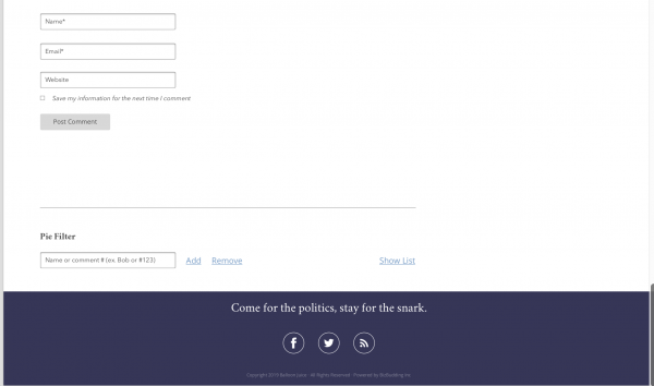
@J R in WV: Pie filter is on there — look toward the bottom. Interesting idea for each commenter to choose whether to only filter the original comments or to filter both. No guarantees, but that could be considered.
The floating bars will not show as floating bars on mobile – they will appear when you touch the hamburger looking icon in the upper right hand corner. See upthread for Scott’s explanation.
I will add another tick mark for Cole’s comments being highlighted in some way. This is not a democracy, of course, but maybe Cole would be open to it if it matters to a number of people.
WaterGirl
@Geeno:
threaded comments – I am giving you the side-eye.
1. permanent nyms etc was a dealbreaker in the specs, all developers agreed that it can be done again.
2. Cyrillic – I can bring that up with the developers and ask if that will be the case
3. sorry, not gonna happen. it would be fun until someone loses an eye.
karen marie
@Ruckus: #DeleteFacebook
Twitter is a bit annoying because one cannot look at tweets in their natural environment unless you have a twitter account. My original twitter account was suspended for a completely innocuous comment but because I refuse to allow it to be struck and replaced with a “she is a very bad tweeter” statement, that account is still locked down and I can’t look at twitter on my tablet. I did some sneaking around and made a new twitter account that I can access on my laptop but haven’t figured out yet how to access the new account on my tablet, because I can’t seem to log out of the old account.
Suzanne
@2liberal: Along these lines…..I have only recently started using the pie filter, and I would love it to work more like a Facebook block. Not only do I not want to see some people’s comments, I also don’t want them to see my comments. Any way to make that happen?
Also too….I hate the mobile site and I very much want to use the regular site on my tablet and phone. Please reconsider…..
Doug R
@WaterGirl: Regarding ads, especially on mobile. PLEASE NO taboola, especially that rage inducing rack of full phone screen multiples that you had to very carefully scroll through to get to comments, phones being really touchy about touching the wrong part of the screen, accidentally going to the page and then getting whatever freaky thing in your adchoices.
Also, will there be translation from Latin?
WaterGirl
@Major Major Major Major: Noted! No promises but I will check on it.
JaySinWA
@WaterGirl: The //http: thing should go away. I don’t know what’s happening with //https: migration but it mostly gets in the way of cut and paste linking.
And the hamburger menu description is archaic, I think, referencing the three layers. Mostly now it is rendered as three vertical dots, like … on its side. I’m not sure it has a name that everyone uses. Something like additional items or more.
WaterGirl
@Geeno: Preview comment in WYSIWYG is in the specs.
karen marie
@WaterGirl: Anyone who includes more than five links in a single comment (including the @reply) should get their own blog.
WaterGirl
@2liberal: Pie filter!
#1 is requested in the specs
#2 current pie filter automatically pies the responses
#3 if you click on the asterisk in a pied comment you can see the actual comment.
#2 and #3 will remain in the pie filter.
FelonyGovt
@WaterGirl: Yes I would like the http in the comment box gone because I need to go in and edit the link every time to remove the duplicate. It took me forever to figure out how to post a link for that reason (yes I’m slow)
karen marie
@Ruckus: I love me some Wonkette – I even send them a small quantity of money – but I absolutely loathe the redesign and visit much more rarely than I used to. The comment thread thing — where the thread for the story you came to read remains even though you’re reading a different story — is really, really annoying.
2liberal
i am picketing for blue cole comments, makes them more visible on his very occasional visits to his own comment section.
JaySinWA
@WaterGirl: If we are going to have the capability of editing comments and have formating stuff in the original comment options, the edit should have the same formatting ability.
ETA our current editor is bare bones.
WaterGirl
@Suzanne:
I have really missed the big comment numbers, too. I asked for numbers to include a period at the end – so if you search for “35” it doesn’t pull up every date and time stand that includes 35 minutes. I love the new big numbers so much that I haven’t pressed them on the “period” but I haven’t forgotten it, either.
In case you don’t know what I mean by “search”, on my Mac if I hit command-F, a find box appears upper left and I enter what i want to find on the page. I use that all the time if FYWP loses my place on the page — I just type in a word that I remember for the comment I was on. That works pretty well for some things, but if I remember “fuck”, I’m out of luck because there are too many matches.
Comment fonts will be san serif, (sorry!)
WaterGirl
@Cathie from Canada: We are. Not to worry.
schrodingers_cat
@Baud: That’s a joke right. It is a huge pain in the neck.
smedley the uncertain
@WaterGirl: Yes. I use it as a repository for the links I do not have or as a quick jump out to see what others are saying after I have read a particularly provocative Jackal comment. It’s sort of an extension of the BJ community for me.
Bless you for all your effort. I’m sure it will be success. Just wear your helmet and keep your head down for a week or so to duck the brick-bats of the chronically never satisfied.@WaterGirl:
Ruckus
@karen marie:
I used to check FB about as often as I do BJ, many times a day. I have friends that I kept up with on FB and really, any other methods were worse. However, a while back I just stopped going on FB more than once a month or so and far fewer ads show up everywhere else and when I do occasionally check my feed the intrusive bullshit is far less. I’d delete my account except that is how I keep up with some friends, found out about one who died, my HS reunion, etc. It’s a not unreasonable compromise. But I do agree that FB is pure evil dressed in electrons. I’ve also avoided a twit account because I’d bet I’d waste far too much time there, right up until I got banned.
WaterGirl
@Cheryl Rofer: I can understand that! What is the version number you use there?
CatFacts
Looks nice! And thank you for keeping the chronological format. The current trends in “Newspaper” formats for political blogs are ugly as sin (hello, sites that reuse the same 5 stock photos ad nauseum), plus it’s basically impossible to tell whether you’ve just clicked on a recent post or a “popular” post from two years ago that the algorithm decided to spit out. This is clean and clear and looks flexible enough to accommodate everything from BillinGlendale’s photos to Mayhew’s tables to Adam’s long text-heavy posts.
WaterGirl
@Cheryl Rofer: Not related to your comment, but…
For highlighted contact, I debated “Nuclear Issues” and then “Nuclear Safety” before I landed on “Nuclear Security”. What would you like as the descriptor?
Auntie Anne
@karen marie: I’m with you!
karen marie
@WaterGirl: Yes, do please remove that http:// – it’s always a challenge to me to get it covered by the “paste.”
Ruckus
@karen marie:
A good example of what I was talking about.
Plato
Half a Tbogg unit already? And it’s only Sunday.
smedley the uncertain
@WaterGirl: Thank FSM!
O. Felix Culpa
@WaterGirl: I like the design and I like Cole’s blue comments.
WaterGirl
@karen marie: I initially asked for the desktop option for mobile devices, and every developer said no to that because this way is the industry standard. That’s about the only “no” that I wished could be “yes”.
Other than that, the only other compromise has been on the comment counter, and I didn’t push for that because they made a good point.
Happy to say there has only been the one “Sorry, Dave, but we can’t do that” responses from the developers.
Doug R
@KithKanan:
Some sites with nested comments on mobile you gotta go to landscape or you have comments
look
like
this.
JaySinWA
@JaySinWA: Also too, you should be able to fix your nym in edit and not have to have an FP’er pull you out of moderation. A comment should be reevaluated for moderation after editing at any rate. Can I make an innocuous comment and then mess with in in edit? Hm’n evil testing temps.
Cathie from Canada
@Doug R: Yes, that’s the way Daily Kos looks to me some of the time, even on my laptop.
WaterGirl
@Suzanne: @2liberal:
Sadly, I think that’s two “no” answers. I am hoping that the mobile site in the rebuild is much more to your liking. If not, that’s crummy for you, but I don’t think “yes” is a possibility.
Cathie from Canada
@CatFacts: YES! X 1,000
J R in WV
@jeffreyw:
What he said!!! Hates them!!!
WaterGirl
@Doug R: Read my lips: there will be no TABOOLA!
As for latin, you are just going to have to learn a new language.
WaterGirl
@JaySinWA:
Happy to say that is already in the specs.
Just One More Canuck
@Omnes Omnibus: Waiting until you’re informed before you start complaining? I thought you were aware of all internet traditions.
JaySinWA
@WaterGirl: @Suzanne: I assume the rendering uses the browser id information. You used to be able to forge those to look like another version or device. With some transparency on the developers part you might just be able to forge your way to what you want.
Doug R
@WaterGirl:
Euax EGO coniecto
J R in WV
@Suzanne:
Serif vrs. Sans Serif — a never ending battle. I believe research shows that sans serif fonts are more readable on e-devices, and I actually prefer them now even in printed texts. But any good font works for me, some fonts are well designed and some are not.
Perhaps we could select a font, set a preferred font for B-J ?! Or a wacky colour, too!!! /s
JaySinWA
@J R in WV: Yeah, I want dark mode damnit
WaterGirl
@JaySinWA:
I thought we could already edit our nym if we misspelled it, but you are probably right. The thing is, the first comment for any nym goes into moderation, and WP can’t tell the difference between a new commenter and a misspelled nym. Not sure we can do anything about that.
JaySinWA
@WaterGirl: You can fix your nym but you are still stuck until someone pulls you out. I’m just saying you should be able to edit yourself out of moderation.
Starfish
@Another Scott: The issue here is that Google Maps is being developed by Satan, and no one needs that picture-in-picture nonsense or the map to ask you “DO YOU WANT TO SAVE THIS LOCATION FOREVER?” No, I am meeting this person for the first time, and we are not besties.
Major Major Major Major
@JaySinWA: i think this is sort of a WordPress core issue that can’t be helped.
WaterGirl
Looks like I’m all caught up. I’m gonna take a break and get some lunch, and give my laptop a chance to recharge.
I’ll come back at 5 my time – which is 6pm in BJ time — to see answer any questions that come in. I imagine there are people who are out having fun and might not see this post until later.
J R in WV
@Ruckus:
I had a co-worker who was screwed by another co-worker and couldn’t defend herself because she had not kept a note from screwer. She literaly printed out every email she ever received, filed them, every single piece of paper she received, filed. Her office was difficult to turn around in, I had trouble just consulting with her on issues, no room for me…
Retired now, I bet she spent the last month preparing to shitcan all that. Or not, I would have left it for the next habitent. I did that myself, packed up my rocks and art, personal docs and coffee cups, left all the files, stuff on the desk. No longer my problem…
JaySinWA
@Major Major Major Major: Can you edit yourself into moderation? I would hope so. (Twirling fake mustache in anticipation.)
Another Scott
@WaterGirl: https://en.wikipedia.org/wiki/Hamburger_button
;-)
Cheers,
Scott.
Another Scott
@WaterGirl: Dunno if I’d be able to be a tester; lots of real-life stuff is coming up soon. I’ll drop you a line if I’m able.
Thanks.
Cheers,
Scott.
MomSense
Thanks so much Watergirl and team!!!
I ended up at a brewery today with a bunch of friends and dogs! There is even a cat in a custom backpack. Not able to evaluate anything right now but I’m about to take a turn dancing with hula hoops.
Central Planning
I was going to make a joke about the latin, but was beaten to it. Hmm, just like the old format.
jeffreyw
@JaySinWA:
QFT
karen marie
@WaterGirl: I’ve been ignoring talk of “comment counter” because I have no idea what it means but suddenly I’m wondering – does this mean that comments will no longer be numbered? I’m hoping that’s not the case and it’s something else that doesn’t affect me (that I know of). Having comments numbered helps me keep track of where I am in a comment thread. I’d hate to lose that.
Starfish
@WaterGirl: When Anne Laurie posts a whole bunch of Tweets as a post, the people who read through feedly usually lose context because the images that accompany the Tweets are stripped. There is a link at the bottom of the tweets so we can click through to either the main site or directly to Twitter to see that content.
We often lose our place when we do that.
J R in WV
@WaterGirl:
You can search for “35space” and not get 35’s embedded in comments that way. And or even ” 35 ” which I do sometimes.
Another Scott
@karen marie: See my comment at #81. It would be great if the Left/Right buttons would have a counter on them, or some other indication that a new comment had been posted on the thread above or below without actually having to reload the page. Or if the New Comments widget on the page updated without having to reload the page. As it is, I spend a lot of time reloading pages that haven’t changed. It would be helpful for people who are on data plans where they have to pay for every byte used.
It sounds like that feature isn’t coming because of ad revenue conventions (money is based on ad page displays, not ad clicks).
HTH.
Cheers,
Scott.
jeffreyw
@Another Scott:
All the cool kids are going to the three dot icon, as noted above in a comment by a person I did not note the name of.
J R in WV
But interestingly, when I search for a number with a space… I don’t get comment numbers at all… I don’t ever search for comment numbers, but if I remember there was a word or fragment, I can use a space. Like searching for ” minute” won’t find 35minutes.
JaySinWA
@jeffreyw: sniff, forgotten already…
ETA not a notable commentator. Hurts, but accurate.
JaySinWA
@J R in WV: Regular expression search or go home /s
ETA you grep me?
Inspectrix
@WaterGirl:
What about a more visible way to see meet-ups? Mentions are usually buried in long threads of comments and I see them too late to make arrangements.
Could we have an events calendar or a pinned map with meet-ups added by a front pager?
Or is there some other creative way to make them just a little easier to stumble upon?
Thanks for working on this!
Another Scott
@jeffreyw: JaySinWA discussed it in #238 above.
That should be called the “Kebab icon”. Dunno if it is though…
What do you know!? It is!.
:-D
Dunno which would be more appropriate for us – presumably the web slingers would know.
Cheers,
Scott.
Ruckus
@J R in WV:
I think I can do one better. I gave the CEO my 2 week notice and he told me I had to tell the boss I described. Told him if he wanted him to know, he tells him, I wasn’t up for any more drunken bullshit. About a week in I was leaving for the evening and the CEO stops me in the hallway and asks a question. As you might imagine there was a twinge of smartass in my answer. CEO said “I can still fire you!” Please do, I answered. “Why did you say that?” Because I get a weeks pay for every year I’ve been here and I can use the money. “Asshole.” I laughed and walked away. Friends who were still there told me after I was gone that I got out at the best time. And I was still friendly with that CEO, he wanted me to fill in my boss as to what I was involved in, told him no, I will tell him but not the boss alone. That’s when he found out that my boss had no idea what was going on, zero, zip, nada. He knew the bartenders at all the local establishments, but that was the extent of it. I’ve seen hell and it had a paycheck.
JaySinWA
@Another Scott: Good to know who remembers you. So i thought most all android stuff went with all kebabs but I see gmail still has a hamburger on the left. Chrome has the kebab on the right in the search box line on all platforms I think. Hamburgers mostly to the left, kebabs to the right might be a rule of thumb. And the bento box from the reference shows up in M$ designs. The … meatball used to be comment in hamburger items to indicate a submenu.
ETA So I guess the hamburger is not completely out of style.
Kristine
Probably way too late in the process to ask if there could be a way to be notified via email if someone responds directly to your comment? Threads fill up so fast that it’s easy to lose track of a question you asked or answered.
This would have to be an opt-in, I think, because the regulars talk back and forth so much that they’d get flooded with emails.
Kristine
And I want to chime in that it’s good to see Balloon Guy again. The redesign looks good.
germy
@Kristine: You could do a word search for your nym in the thread? Anyone who replies will have your nym in their comment.
JaySinWA
@Kristine: No to emails but a search for mentions? I’d love that, especially if you could search across recent posts.
ETA or a notice bell for mentions, that would be spiffy. Some forums have an alert option, for a post you want to follow, that probably wouldn’t have much use here because of the number of posts per day.
Ruckus
@Ruckus:
Forgot to mention that I was manager level, with only one person between me and the CEO, whose office was next to mine. Only one person could screw with me at that office, and he did, and besides I had made sure that I didn’t piss off any of the rest of the employees without real and obvious cause every day I worked there. And there was no real and obvious cause. I’ve been both employee and employer and know very well the need not to piss off people for the sake of one’s own ego.
tybee
@West of the Cascades: i, too, will miss the blog roll.
jeffreyw
I just remembered an issue that is only mildly annoying, but when I reply to a comment and hit post it leaves me looking at the comment I just made. Nice, in a way, that it lets me look for typos and such right away. I would like for it to take me back to the comment I am replying to so I can continue reading from there. I could (and do!) click on the nym that is included in the reply. Like I said, only mildly annoying. Maybe not even that. Just never mind! Sorry I brought it up!
zhena gogolia
@WaterGirl:
Oh, I kind of liked the blue comments. He comments so infrequently, it was nice to be alerted. But not a big deal.
Doug R
@JaySinWA: Looks more like grilled cheese sandwich and stoplight to me.
Ruckus
@jeffreyw:
Not that long ago when I hit post it would take me back to the comment I had replied to. Now it takes me up a few comments so I’m looking neither at my comment nor the one I replied to.
I’d bet this has as much to do with each browser and OS than it does with the site. I have noticed that when I update a browser the site often acts different than it had been. It could be that the site is so borked from revision after revision that a complete blank page rewrite was the only way to have at least a consistent process.
NotMax
Initial purely personal reaction. Have only skimmed comments so apologies for any duplication.
1) Move comment number above the separator line (i.e., the area where the nym is). When we get to 3 digits (not uncommon), those extra numerals will take up more space and scrunch the comment text to the right.
2) Quote marks in the blockquote area are extraneous. Doin’t care for ’em at all. Not no way, not no how. There have been and doubtless shall continue to be times or occasions when what people but in the blockquote box is not an quote or citation but something for other purposes – emphasis by isolation, humor/snark by way of layout or other purposes. In cases of nested blockquotes, those huge quote marks will be visually cumbersome and impede clarity, also too.
3) Lighten the colored background in the blockquote boxes. If it is deemed necessary to have a colored background there, as in the image above it is too jarring on the eyes. As pictured above, it also makes it much more difficult to make out the text in the blockquote, as that text is appearing as more gray than black.. If it must be a colored background, why green? A very pale blue, in complement to the colors of the page header would be preferable, along with using the same dark color for the text as employed in the comment itself.
4) Recent Comments? Yay!! However there is no need for teaser text of the comment – it just takes up space (and if someone should being his or her comment with a blockquote, the teaser would show that instead of the commenter’s words). Also the time of posting included in Recent Comments would seem to be unnecessary. As by definition it shows X number of most recent comments, that alone serves to indicate which threads are active regardless of the time stamp.
5) Don’t see the elephant ear tabs pointing to previous and next (if any) post. Those are handy to have.
6) No edit function?
7) Could we possibly get a screenshot of what the front page looks like, not just a comments page?
8) Can’t tell if the hard coded
https:has been excised from the Link function. Hope it now swims with the fishes, as it often causes people’s links to break.9) This is more of a tenuous suggestion, although motivated by the history of mismade links or capture of the reply button. Rather than just a single ‘link’ option above the commenting box, could it be split into two: ‘Open Link’ and ‘Close Link’ – maybe that would be less confusing to some as to how to insert links.
10) Rather than Date – Author’s name – # of comments, would prefer Author’s name – Date – # of comments, as it is currently set up. Credit where it’s due and all that.
11) Something about the font chosen really bothers me. Can’t quite put my finger on it but it lacks a certain heft and weightiness. And the kerning (proportionality) is definitely too kooky. Look, for example, at the phrase “Ut enim ad minium veniam” to see how the lower case n and the m are squashed up against the i. Or the word “elit,” where the l and the i are nearly indistinguishable from one another.
12) The word “comment” under “Leave A Reply” is unnecessary. How about changing Leave A reply to something more inviting, for example, “Add Your Comment”
13) Hard to tell because of the way the screenshots were made but there doesn’t appear to be a separator under a comment, making the nym Thurston look like it’s a part of the comment above it.
14) Last, the background color appears to be a much brighter white than is the color background color. On a large monitor all that white space will be blinding.
NotMax
Oh, one more thing. Double – nay, triple-check that the number of comments appearing on the front page at the time of it’s loading matches the number of comments on the comment page at that same time. Currently that is entirely hit or miss. Mostly miss.
John Cole
@WaterGirl:
You all really do think I never read the comments, do you? Why do people confuse not having anything to say with not reading something? My mom does this too- she’ll talk and talk and talk and I won’t say anything and she just assumes I’m not listening.
Also fuck avatars what is this 4chan?
Kristine
@germy: Maybe it’s just me, but this site gets so busy sometimes that I forget which thread I commented on. The conversations drift, so the title of the thread often has nothing to do with what I posted about, and if it’s hours later, or the next day, forget it.
If I recall the thread, I do search via Find in the browser menu.
NotMax
@NotMax
Oh, shazzbot. its, not it’s.
(leaves desk to find wet noodle for self-flagellation)
joel hanes
@WaterGirl:
Preview is wonderful, and I could live with WYSIWYG in the preview pain
I am reassured, and back to grateful.
RoonieRoo
Just a quick drop by that I really like the design. It reminds me of the older design that I miss. Also thank you for the fight against threaded comments. The lack of threaded comments is part of what I love about BJ comments.
NotMax
@NotMax
Oughtn’t try proofreading before first cup of coffee is duly emptied.
Make that “a much brighter white than is the current background color” rather than ” a much brighter white than is the color background color.”
Also, should read “what people put in the blockquote box” rather than “what people but in the blockquote box.”
The other typos I neglected to catch don’t affect clarity as much as those do.
joel hanes
@John Cole:
You all really do think I never read the comments, do you?
Well, I counted six times in four threads last year when people looking at your nest/eggs pictures told you “house finch”, but when you posted the picture of this year’s nest/eggs, you still didn’t seem to know what kind of birds they were.
Would you like a nice Petersen’s Field Guide to the Eastern Birds? I’d be happy to send you one, now that you’re rearing and feeding and all. The painted identification pictures emphasize the field marks that are diagnostic in identification, which makes it IMHO far superior for a novice than one of the guides with photographs.
BTW, finches (who are seed specialists) like the “thistle” seed that pet good stores sell as “niger”, and adore the Audobon finch mix, which IIRC is niger mixed with chopped black sunflower kernels.
?BillinGlendaleCA
@John Cole:
Yes.
joel hanes
@jeffreyw:
when I reply to a comment and hit post it leaves me looking at the comment I just made.
Worse than that, on a desktop the current design changes the URL in the address bar to be specifically the URL for your comment, which sticks the browser so that no matter how many times you hit refresh, comments much past your most recent one will never be displayed. I’ve been having to manually remove the #commentblahblah off the end of the URL, or go to another site and come back to see what’s been said since I last commented.
Because the implementors are pros, I’m assuming that this will not be the case on the new site design.
glaukopis
Another vote for Cole’s blue-colored comments.
Sister Golden Bear
@WaterGirl: if you’ve got any follow up questions, just shot me an email.
FWIW, I’d insist that the developers also provide a mock-up of the mobile version. Most stuff should just be “responsive design,” that just adapts, but headers usually require switching to a different version at mobile sizes. So there can be some issues that come up when making the switch.
WaterGirl
@karen marie: Not to worry, comments will still be numbered.
What we’re talking about would be a feature where you would be able to see the total number of comments in a thread without having to reload the page. Say you’re on comment 280 – right now you have to refresh/reload the page to see how many more comments have been added. So the “counter” could show that total comments was at 301 and you could know that 21 comments had been posted since you last refreshed.
But as I explained above, there’s a good reason not to do that, so it won’t be happening, at least not at this point.
WaterGirl
@Starfish: I don’t have an answer for that, but I will make note of the question and follow up. thanks.
WaterGirl
@J R in WV: Interesting. Just tried that, and that doesn’t work on my mac in Safari.
WaterGirl
@Another Scott:
I can ask about that, but absolutely no promises on a different answer.
WaterGirl
@Inspectrix:
That’s an interesting idea! thanks
daize
Looks great. Clean and classic. Sorry if this was brought up already… will there be the link to submit pet pictures for the calendar?
WaterGirl
@Kristine:
don’t think that’s a feature we’ll go with at this time. I think that feature was tried here for about 45 minutes a few years ago and then taken down; I always assumed that it had turned into a nightmare, but I guess I really don’t know that for sure.
I do the same thing as germy. If it’s something important to me, I will leave the BJ tab open and then search for “watergirl” to see if the person replied to me.
WaterGirl
@jeffreyw: That made me laugh!
Actually, for replies, I believe we won’t be taken down to the Comment box – it will sort of come to us at the thread we are replying to. I haven’t seen that in action yet, so I can’t answer any questions about that.
NotMax
Minor, but shall mention again a Birthday List. Some may be skittish about the self-promotion of announcing their special day.
WaterGirl
@JaySinWA: I have asked for the search box to find matches in both the posts themselves and from the comment section.
Right now, if I use the search box for my nym I mostly find Garden Chats where Anne Laurie has posted my garden picks. If the search box functions in the way I described in my first paragraph, that could possibly get closer to what you want – I assume recent matches would appear first. I haven’t seen that in action yet, either, so I can’t say more than that.
Kristine
@joel hanes:
I have the mix–a different brand but same seeds–in my finch feeder, and over the past few days, you could watch the level drop in real time. Even the downy woodpeckers like it.
WaterGirl
@Ruckus:
This happens to me, too, and it makes me crazy. I have mentioned it in the spec list; we’ll have to see what happens on that one.
WaterGirl
@John Cole: That was my attempt at humor – saying “don’t tell Cole” in a comment on your own blog!
Oh, and why would I tell you they offered us avatars when I already knew from our experience on the Sunday avatar thread so long ago that they were a no go. :-)
WaterGirl
@Sister Golden Bear: Agree, I added that to the list when that came up earlier.
WaterGirl
@daize: See my comment at #57. Seems like a lifetime ago!
NotMax
Think I’ve hit on what else nags me about the font aside from what I mentioned above. (Again, purely personal.)
The old school curlicued lower case g clashes with the general look of the rest of the text, and stands out like a sore thumb even more in comparison to the lower case q and y.
daize
@WaterGirl: You are very kind. Thank you. Sent a wee contribution.
NotMax
@NotMax
Might suggest having them do a mock-up of the same page(s) in an easy to read clean and crisp sans serif font which most everyone already has installed, such as Verdana, and doing a side-by-side visual comparison.
WaterGirl
@NotMax:
#1 unlikely to make that change.
#3 talked with the designer about that on thursday; I love the color, Cole loves the color, and the designer feels that it’s in the same color family and believes it works.
#4 removing the teaser text is already on the list for changes. As i mentioned up top, some things had already changed and aren’t reflected in the mockup that is here. things are moving very quickly and it’s just not possible for the mockup to be more than a reflection of a single point in time. the time is important if you are trying to see when the last comment was made. could be 5 recent comments, all from the last 5 minutes. or they could all be from 5 hours ago.
#5 they are there, just more subtle. Look near recent comments on the right-hand side.
#6 of course there is an edit function.
#7 covered above. that will be tomorrow night. we wanted to focus the discussion to a page at a time rather than people talking about 5 pages at once.
#8 discussed above
#9 will not be making that change. just highlight the text where you want the link to show up, and then hit “link” once.
#10 here is the format for the information about the post; it just didn’t make it on to the mockup before the end of the designer’s workday:
by John Cole | 5:15 pm on May 10, 2019 | 75 comments
#11 font was selected late Friday, not sure if it’s the one in the mockup or not.
#12 that change was already made, just not reflected in this mockup
#13 it’s not a problem – it’s just not showing up well in the image.
#14 noted, but no guarantee of a change.
NotMax
@WaterGirl
re: #14, will note that during Tommy time the site started out with a similar bright white background and there were multitudinous comments about people having to reach for sunglasses due to the vistas of glaring tundra-like white.
The current more muted background color is oh so much easier on the orbs, IMHO.
NotMax
@WaterGirl
re: #3. In that case, darken the text within the blockquote. It’s too pale.
NotMax
@WaterGirl
Also re: #3, feel that the giant quote marks add naught but visual clutter.
Ms Kondo would frown. ;)
WaterGirl
@NotMax: I’m not fond of the quotation marks, either. we’ll see what happens.
NotMax
Neglected to inquire as to whether stackpathcdn will be given the ax. Please.
stinger
@Dorothy A. Winsor: I can’t speak for you, but for myself I think it’s a product of our current government and society. Most of the changes in the past two and a half years have been for the worse, dreadfully so.
NotMax
@WaterGirl
Might have ’em set up some nested blockquotes to confirm (or not) how clutterific and distracting they become.
WaterGirl
@NotMax: We are not using stackpath.
WaterGirl
Whew! I am out of gas for the evening. The Doctor is Out. (so to speak)
Good night, all!
NotMax
@WaterGirl
Hip hip hoorah!
karen marie
@WaterGirl: The industry can get stuffed.
Alternative Fax, a hip hop artist from Idaho
@WaterGirl:
That should be easy enough to tell the developer “no quotation marks”-it’s a very simple fix (leave them out).
From NotMax #308
I agree that this combination is extremely hard to read.
@WaterGirl:
That’s great,; I’ll suggest y’all run it by the potential readers before making it final. I repeat: This combination is extremely hard to read because there is not much contrast between background and text. As NotMax suggests at #342
NotMax #308
@WaterGirl:
Again, I’ll suggest y’all let potential site users take a peek before setting it in stone.
I agree with NotMAx at #340
It’s hard to tell from a screenshot but if it’s as bright as Tommy made it, it could be problematic. The appearance of brighter white may simply be an artifact of the screenshot.
Fino a domani.
karen marie
@WaterGirl: oh, well, that would be handy. I am so used to hitting refresh, it never occurred to me that might not be necessary. I am assuming though if I have a particular post open and people comment while I am doing something else that the page would need to be refreshed to see the newer comments? I would think if the new comments automatically populate it might jerk the page around if one were at the top or middle, especially in a long, active thread.
Who knew there’d be so much to think about! Thank you very much, WaterGirl, everyone else working on the upgrade, and most especially our host, Lord of the Blog, John Cole.
WaterGirl
@karen marie: Not to worry, new comments will not be populating automatically.
WaterGirl
@Alternative Fax, a hip hop artist from Idaho: Taking the quote marks out is beyond simple. I don’t care for them but Cole liked them fine, so I left them in and figured we would get feedback one way or another today, which we did.
And of course readability is being taken into consideration. But let’s not get ahead of ourselves. You guys have to remember that we are working with mockups at this point, the actual development hasn’t begun, so there’s no screen to even look at to judge brightness.
David Anderson
Switch the category : Mayhew on Insurance to Anderson on Insurance
WaterGirl
Remember, what you all are looking at is an image of a mockup of a blog, posted on an actual blog. It’s not ideal, but I was thinking that you guys might all want to see what it looks like at this point and would welcome the opportunity to share your thoughts.
Another Scott
@WaterGirl: Indeed. Thank you! We appreciate (all of) your efforts! Don’t let our sometimes strongly expressed opinions make you lose sight of that.
Colors and spacings and such were tweaked after the previous re-design. I would expect that there will be opportunities to do that this time as well, if necessary. JC’s been known to change his mind occasionally. ;-)
Thanks again.
Cheers,
Scott.
WaterGirl
@David Anderson: @David Anderson: Where are you seeing Mayhew on Insurance? If you are looking at Quick Links, that is the current blog.
You show up on the right-hand side in the mockup as: “David Anderson | on Health Insurance”.
Either that or I am losing my mind.
Sister Golden Bear
@WaterGirl: Here’s a resource for checking if there’s adequate contrast for accessibility:
https://webaim.org/resources/contrastchecker/
If Cole is attached to the background color, then I’d recommend using a darker color for the text.
FWIW, the link colors are likely insufficiently contrast as well. However, you can mitigate that on desktop by adding an underline onHover, which a pretty common practice, or by adding underlines to the links within a body of text, e.g. links within comments.
We’re still on the accessibility learning curve with the outside company that’s doing the audit, so I’m not sure how insistent they are about all links having secondary indicators, such as underlining, to indicate that they’re links. (It’s a bit different for us because it’s legal liability issue.) For my UX designer POV, I think some things are clearly links by context, e.g. the links in the header, the “reply,” etc. So it’s less necessary to make those links “linky” appearances.
There’s also some boilder-plate accessibility stuff that your developer should be doing, e.g. ensuring proper tab order, accessible link menus, etc.
Inspectrix
Is anyone else learning lots of new things from this thread?
I don’t know a thing about web design, so I’m fascinated by the back-and-forth by those that have that knowledge.
I just switched to reading on my laptop and now I can see Cole blue and the blogroll that I never noticed.
I guess I’m late to the party. The drinks and snacks are running out, and the cool people have moved on to someone else’s house.
J R in WV
@WaterGirl:
Nope… I thought it would work… it does work for non-comment numbers, as in text of a comment. Not the first time I’ve been wrong, but of course in front of the whole innertubes — wow — that’s a humiliation!!
NotoriousJRT
@stinger:
I am also in this camp.
NotMax
Mr. Cole simply needs to get his own dedicated server.
Steve will be ecstatic to have a nice new pre-warmed bed in the manse.
JaySinWA
@WaterGirl: Cool, then we could do the “Washington read” (just check the book index for our name and read those pages). I still think a notify feature would be cooler for dynamic tension but hey, beggars can’t be choosers.
JaySinWA
@NotMax: Jeebus, we are not relitigating buttery mails here!
NotMax
@JaySinWA
Waste of bandwidth when it comes to those who use phony or throwaway, never checked e-mail addresses.
WaterGirl
@Sister Golden Bear: Thank you!
Ithink
I’d so be down with some more unconventional fonts like cool jazz, rosemary or gothic bold as our typing or display ones here but those are merely my faves from my phone…
Usually averse to change but you guys di so much perfect just providing a wonky and unapologetically progressive news blog/media site in this neverending nightmare of a Trump era I can’t complain about much of anything around these parts or how its run! I know I probably need to comment more personally.
Honestly, can we not shut down or off comments on a thread until it’s at least a year old. That’d be terrific to me!
Major Major Major Major
Testing
TomatoQueen
My thanks to all Upgraders for the whole process, mirabile dictu it’s happening.
I join jeffreyw in fervently hating floating bars they need to fuck right off. OTOH, Latin posts from Lily and Thurston are the best idea anyone has ever had.
And it will be most interesting to see what happens when I open up the site in the gov’t laptop, IE, Windoze7, vpn, twit, fb, yootoob and web gateways completely blocked, no webmail access at all ever, and see if it even works.
Tonight John’s blue background is coming out light green.
GREAT STUFF.
HeartlandLiberal
Having written computer programs, some of major scale, for 35 years, I was reminded of some our humor in the trade about projects. This from Wikipedia:
Summed up by this aphorism: Projects progress quickly until they become 90% complete; then remain at 90% complete forever.
We used to know that one by heart.
WaterGirl
@Ithink: As soon as a thread turns 1 month old, comments have always been turned off for that thread. We’re not planning to change that, so I guess you got your wish!
Bard the Grim
So many sites have been ruined by adding whitespace (by which I mean open, empty, useless space of any color, not just white). Keep things compact: high information density, less time wasted scrolling scrolling scrolling and losing your train of thought. Death to whitespace. I beg you.
Madeleine
I’ve been reading the comments over the last day, as Inspectrix said, learning a lot. I’m also extremely grateful to John, WaterGirl and the others on the design committee. The new site is looking good to me, granting that I’m not especially particular except that it be uncluttered and easy to read.
That brings me to one point of agreement with some other commenters. Since I’m visually impaired (though I can read quite easily most of the time) I rechecked the block quote contrast, and I’d say that increasing it would be helpful.
Finally, I’ve appreciated the Blog Roll. I don’t use it often, but sometimes when I’m looking for something new to read, that’s where I go. I’ll miss it. I can live without it.
BroD
I have no worthwhile input. I realize however that this means it will be my fault if this goes badly.