On the Road is a weekday feature spotlighting reader photo submissions.
From the exotic to the familiar, whether you’re traveling or in your own backyard, we would love to see the world through your eyes.
Steve from Mendocino
In late November of last year, Janie posted a series of photos of fall colors in Maine that I found compelling for their artistic sensibilities. I also felt that it was unfortunate that they hadn’t had post-processing attention to bring them to their full potential. I contacted WaterGirl and asked if she could put me in contact with Janie, after which I asked Janie if she would object to me having a go at editing that set for our mutual entertainment. Since that time, I’ve been fortunate enough to work regularly with her as she explores the world with the new camera she got early this year
Janie has a lovely take on her part of the world and a knack for finding magic in the mundane. The geometry she finds in a chaotic environment, her sense of light and color, and above all her manifest love for the rural Maine landscape she calls home all contribute to the peace and beauty of her work.
I’ve spent an hour or more a day editing her photographs, and I display them in a random slide show in my kitchen – the household gathering spot. I can’t express the pleasure these pictures bring to my wife and me, and I urge anyone interested in rewarding photographs to spend a bit of extra time soaking up the beauty of the images in this set and the others Janie will be posting as time passes.
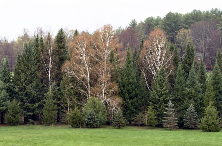
This first picture reminds me of the jungle paintings of Henri Rousseau – the palette, the feel of the vegetation, the orange trees standing in for the fauna. This scene has a wonderful interplay between the various greens and the orange and dark cherry elements woven in amongst them. The red house adds a bit of mystery and humanity to the scene.
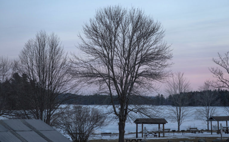
Janie told me early on that she likes skies with silhouettes. The RAW file I got from her for this picture was an intense sky and deep sapphire frozen lake with all other elements black silhouettes. I was able to scrape a good bit of detail out of the shadows while retaining those beautiful pinks and blues. The laciness of the trees and the background forest contrast nicely with the hard geometry of the human structures, and there’s a nice visual movement from left to right
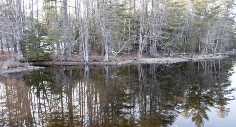
This photograph intrigued me from the start. The late afternoon sun interacted with the colors of the forest and the shoreline in a sour blend that I initially tried to edit out of it. After much fooling around, I just gave up and went with the surrealness of the colors and have grown quite fond of how it turned out. There’s a messy spiderweb effect of the light gray tree trunks and branches which, accompanied by their reflections, dominate the subject matter. The orange of those elements lit by the late afternoon sun contrast with the mossy green colors to give the overall image a near bichromatic feel.
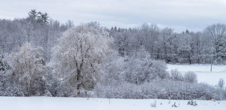
This is another bichromatic image, but much more restful. The pastel yellow of the two willows contrasts with the pastel blues of the rest of the subject matter. The open field on the right of the frame balances the block of the two willows, as well as providing a visual movement across the frame. Personally, I like the power lines and poles and the way they introduce that hard human intrusion, however subtly. Janie initially objected to the way I leveled the field in the foreground to be roughly parallel with the frame. She said that the road that cuts across the field on the right should be going uphill, and she objected to that distortion from reality. I, in turn, pointed out that photography as art is an expression of the emotion derived by the photographer from the subject matter, and as such is already an extrapolation from “reality.”
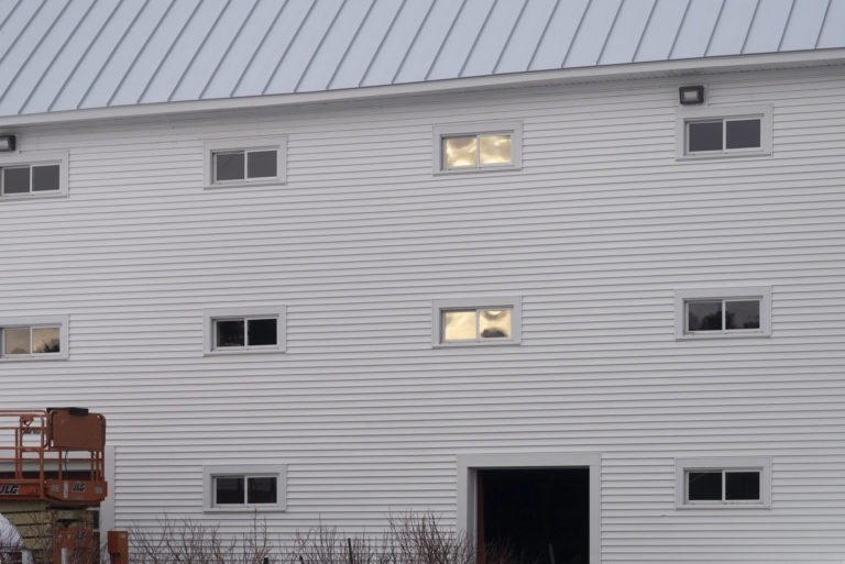
Janie keeps coming back to the same subjects over and over using light, the seasons, and her own creativity to produce photographs that say very different things each time she shoots them. In this one, the orange of the farm equipment in the lower left underscores and amplifies the largely monochromatic quality of the barn in this light. In addition, it provides a more complex and chaotic geometry to contrast with the regular geometry of the windows, the door, and the roof of the barn. In later photos you’ll see this barn in very different lights, both literally and metaphorically.
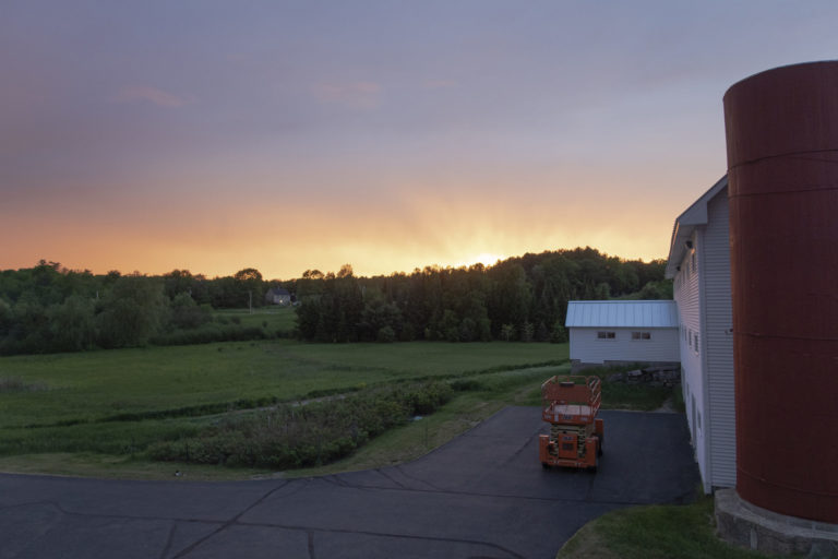
For this one I had to use everything I know to control the extreme dynamic range of the RAW file, which was bouncing off of clipping on both ends. It would be impossible to capture this effectively on film. Modern digital has changed everything.
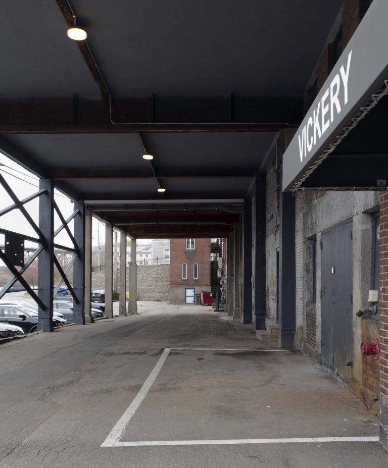
The visual movement down the sign in the upper right and into the well created by the covered receiving docks combines with the repeating verticals and horizontals to create a compelling geometry.
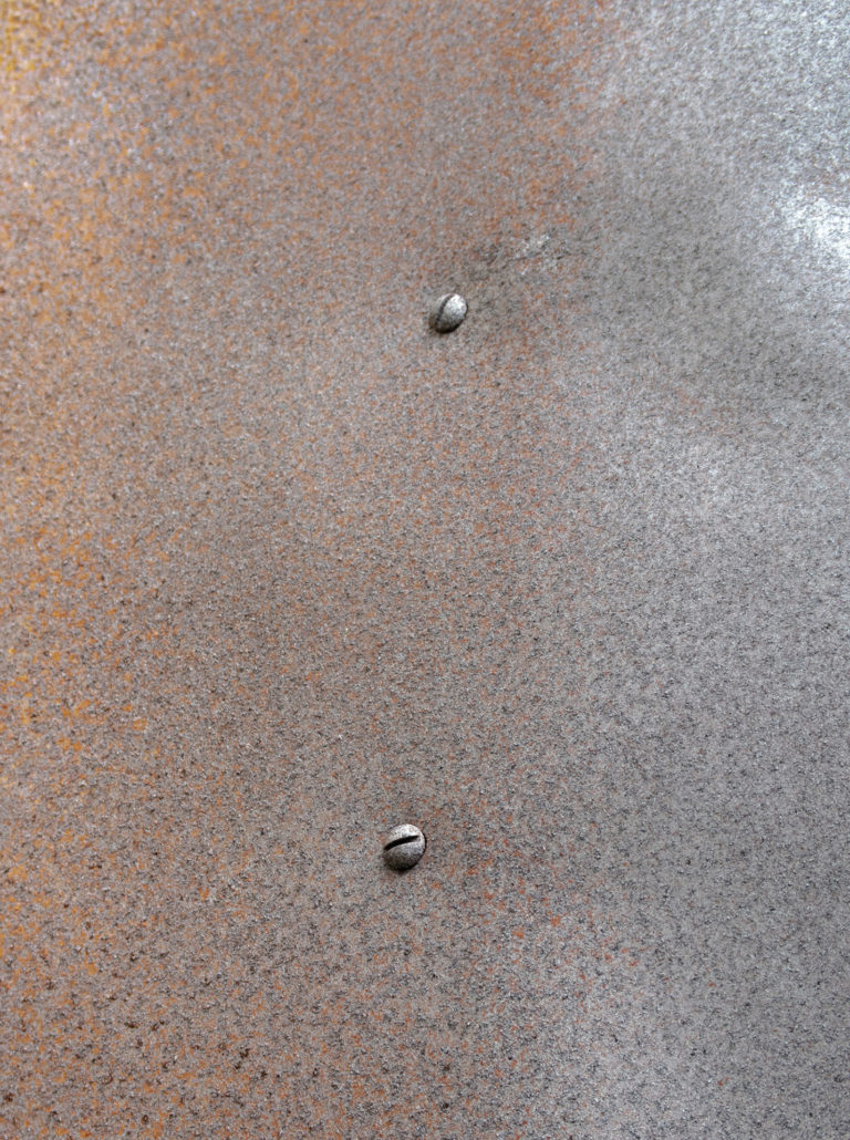
Janie has done some shape studies along the way, and I chose this one for its simplicity and its consistency with the color palette of the other photos posted above.
 The Failure In Afghanistan Was the Result of Everyone Wanting to Grade Their Own Homework
Van Buren
The barn has an Edward Hopper feel to it.
Rusty
Steve and Janie, thank you for the beautiful collaboration. I especially appreciate the explanations of the photo editing. Thank you for sharing.
Betty
Great results from your collaboration. Look forward to seeing more.
Lapassionara
Wonderful! Thank you both.
SiubhanDuinne
Those photos are lovely — what a great collaboration! I am especially drawn to the delicate colour differences and textures in the last one.
Albatrossity
Gorgeous images, and great work. Thanks for the explanations of what you were doing/trying to do with those image files. Processing digital images is a process of constant learning, I’ve found. But yes, I agree. It would be impossible to get much of this artistic output if you were restricted to film. The digital medium has changed everything, as you note.
Mike in Oly
Really beautiful work. Love the color gradient across the texture in that last shot.
JJ
Beautiful work and commentary, and especially appreciate these works being a joint effort between the two artists.
Steve from Mendocino
It’s interesting to see these photos up here on BJ after spending so much time looking at the original full sized, uncompressed files. I ask myself “how would I edit these images as displayed?”. I already make special adjustments when I go to print. Clearly, I have much to learn about adjusting photos for displaying here on BJ.
Thank you all for the nice comments.
stinger
Fascinating!
YY_Sima Qian
Nice photos! & great collaboration!
arrieve
Beautiful photos, beautifully enhanced. The trick with processing is to keep the photos looking as though they haven’t been processed, and these are really well done.
?BillinGlendaleCA
Nice processing Steve, photos out of camera(even jpg’s that the camera processes) need some additional post processing.
way2blue
Steve & Janie,
Would love to see before / after for some of these photos. And know what you used to tinker with them — PhotoShop? Lightroom? The detail, especially of the trees, is wonderful. Thanks.
Steve from Mendocino
@way2blue: Lightroom followed by Photoshop. Over the years I’ve tried to move more and more of it into Lightroom so that I’m working in RAW. I’ve also started keeping the TIFF files created from the export into Photoshop in Prophoto color space and convert to Adobe RGB only when exporting to JPG. I’ve damaged so many of my edits over the years by doing most of my edits in sRGB. I keep getting better yet there’s always so much more to learn. Best advice I can give at this point is go slow, think a lot about your next move, don’t be afraid to just start over if things aren’t working out
Send me an email at sjenks at mcn dot org and I’ll respond with an image that gives you some idea what these pictures really look like.
?BillinGlendaleCA
@Steve from Mendocino: In Photoshop, don’t be afraid to “stamp up” to create a layer you can trash later. I’ve been adding a LUT(Crisp Warm) via a luminosity mask(lights) to my sunrise/sunset shots lately.
mikereport
You can right-click on the photos and “Open in New Tab” for a lightbox look. But the images don’t get bigger, alas.
Albatrossity
@mikereport: You can edit the link by removing just the proportions and the hyphen preceding those (e.g. “-768×1030” for the last image in this set. That edited link will be embiggened.