This is going to be a geeky and meandering post as I’m trying to get some thoughts together for a new project. I was able to spend a lot of time this week diving deeply into raw ACA public use files (PUFs) and my own processed version of those files since I started my doctoral program.
A colleague and I are very interested in how a certain aspect of menu length impacts the quality of plan choice. We know that there are a lot of choices on the marketplaces including Healthcare.gov.
We know that a lot of people make mistakes.
One of the things that we want to control for in our analysis is whether or not a county lost an insurer from the previous year. There is evidence that enrollment decreased in a county when an insurer leaves the county. This makes sense, an insurer leaving is an attention and action neccissitating shock especially prior to automatic re-enrollment mapping between insurers. So I spent a good chunk of yesterday data cleaning and data organizing to identify county-years where the full suite of insurers from the previous county-year did not participate in the market. You’ll see what we’re doing with this in a future paper.
However, as part of the data cleaning, I was seeing a lot of county-years gaining or losing a lot of plans. I don’t have much going on with that data point yet, but this is curious to me at least. I performed a very simple regression to try to predict the current year plan offerings by regressing only against the prior year’s number of plans offered. A real model would have year and state fixed effects, Medicaid status indicators, county characteristics (likely fixed effects as well), plus several policy and politics variables but I’m doing this on my free time when I really should be doing homework, so a quick and dirty simple linear model is what I did using Healthcare.gov 2017-2022 data:
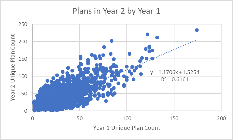
Wow, this is a pretty decently fitted model. Prior year plan counts explain about 60% of the variance of current year plan counts. There is an upward trend which makes sense in the data context as 2018 was a local minima of plan offerings and since then insurers and plans have been returning to the markets. The trend is not surprising.
But not everything is explained by the model. There are some big residuals.
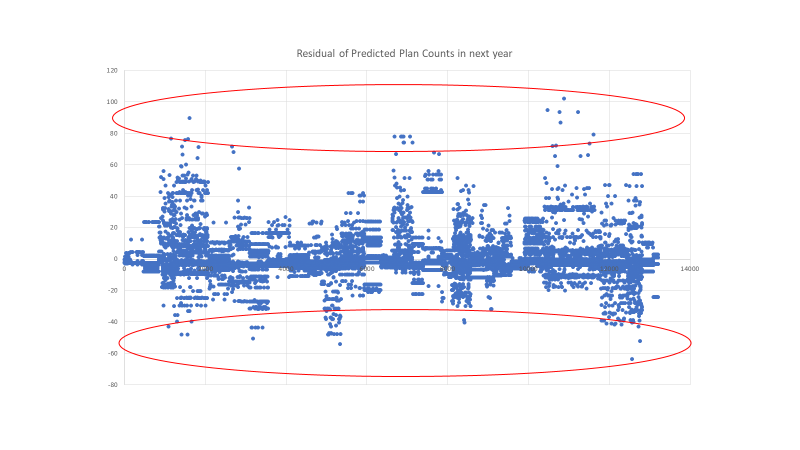
Grant County, Wisconsin for 2018 was predicted to have 92 plans offered on Healthcare.gov. It had 29 plans. This was a short menu shock.
Harris County, Texas (HOUSTON) for 2022 was predicted to have 99 plans offered on Healthcare.gov. In reality 202 plans were offered. This is a long menu shock.
I’m not sure what I can hypothesize from these simple stylized facts. I know at this point that these are weird situations that should be able to provide insight on some aspect of human behavior but I’m not sure what the right question is. If Jackals can come up with interesting questions, let’s talk.
 President Biden Provides an Update on Russia and Ukraine at 9:45 am ET (LIVE)
Fake Irishman
My first thought was state-level policy and county population, (or population size of the rating region). of course, you have already suggested those things for a real model. And population size effects would likely be baked in as part of the previous year’s offerings. But perhaps particularly heavily populated areas or relatively low ones will have different rates of change. Not necessarily sure why (predictability of business, greater or lesser susceptibility to an outlier patient in a non-reinsurance state, I dunno)
Ohio Mom
Not really what you asked for, but how much does all this re-inventing the wheel cost?
For every plan, how many staff hours to create it (which is surely a multi-step, time-consuming process) and how much goes into packaging and marketing it? Then there are the plans that got discarded mid-development, that cost money too.
There also must be costs once plans are established and contracted with staff trying to keep it all straight both at medical offices and the insurance companies. Well, they don’t keep it straight, then there are the costs of tracking the and correcting all the mistakes.
debbie
Hmm. FInding out a week before leaving the company that COBRA is not being offered probably means I should have looked into this sooner. //
Ohio Mom
@debbie: I remember that you were unhappy about the Covid policies so not that surprised you are moving on.
Surprised however that COBRA is not an option for you. Yikes! Except I think ACA plans can be cheaper sometimes. But yeah, you have a time crunch.
Ohio Mom
Just goggled, I see that an employer with less than 20 employees does not have to provide COBRA. Which is a lot of employers.
Lobo
I will try: What effect does the amount of plans and the level of change in the number of plans impact consumer behavior? What outcomes does it lead to?
My thoughts for free(that might be what they’re worth) ;)
Uncle Cosmo
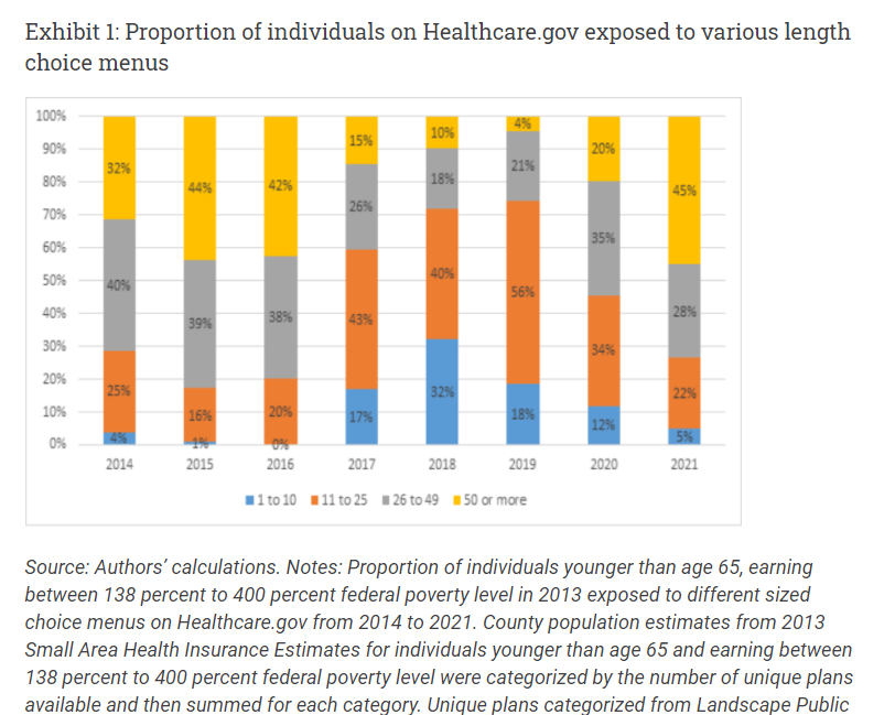
Minor cavil: In the first figure you should also present the total number of plans by year. I presume it was relatively constant from year to year. If not, presenting percentages is at best misleading. And it might not be, if plans are entering and exiting the marketplace at a “smartish pace.”
Major cavil: Your regression appears to be based on a classic Stat 101 mistake: The data is unevenly scattered along the x-axis. A significant number of “outliers” have inordinate impact on the regression equation and the R2, compared with the traffic jam of points further in. My experience (see above) suggests that if you removed the 20 data points with Year 1 Unique Plan Count > 100 the R2 would
drop like a rocknot be nearly as impressive.Final cavil: The pattern of residuals – specifically, what looks like a sinusoidal variation in the scatter of the residuals – suggests that something rather important** is lurking in the data that hasn’t been accounted for. Another reason not to be overly impressed with the R2 value.
** Let’s not say “significant,” as that is easily confoozled with statistical significance, something else entirely which is widely and wildly misunderstood by most non-statisticans and many statisticians as well
Uncle Cosmo
Extra credit cavil: Why do you routinely insist upon posting your entire threads (including significant graphics) above the fold? Particularly when a very small number of Jackals seem to find your topics interesting and/or comprehensible?
You are not the only front-pager who takes liberties on above-the-fold length. But in their defense, the others (not naming names here!) generally get far more engagement from the Jackaltariat. E.g., after 3 hours on the front page this thread has attracted, what, 8 replies? (Two of them [mine] smacking you around for questionable procedures?)
If you don’t know how to insert “the fold” so that most of your long, drawn-out, arcane, obscure, graphics-heavy threads lie iceberg-like beneath it, maybe WaterGirl or some other FPer can offer you some help.
debbie
@Ohio Mom:
Not mine. I’ll figure something out.
Mike in NC
This week I had to prep for a routine colonoscopy. The last two identified multiple polyps and I was scheduled to get the procedure every three years. So this week I fasted for a day, then drank massive quantities of laxative to the point where I couldn’t even sleep last night. Good news is they only found one lousy polyp today, so no need to go back for FIVE years. I was ready to do a little happy dance.
Of course, colonoscopies are fully covered by the Affordable Care Act.
narya
Is menu length or change in menu length related to likelihood of enrollment in dominated plans?
Jim Bales
David,
A few thoughts. The year-to-year change is about companies either deciding to offer more plans or fewer plans, or about companies deciding to enter or leave a market. It strikes me that how many plans exist in the market now is only one of many factors that play into that decision.
Conceivably there may have been some years in which companies felt particularly “bullish”, and others in which companies felt particularly “bearish”. If I understand your graph correctly, it would average over that temporal variability.
Finally, there is a built in a symmetry and that the number of plans cannot go below of zero, but it can go arbitrarily high. This would bias towards a net year over year increase, which your slope of approximately 1.17 shows
This would bias towards a net year over year increase, which your slope of approximately 1.1 shows
Best
Jim
Cedichou
Reading Thaler/Susstein’s Nudge right now and it looks like the lessons from medicare plan D just went ignored…
SamIAm
@Uncle Cosmo:
What’s the big deal about that? Scrolling isn’t that difficult.