The Kaiser Family Foundation is keeping track of 2019 rate filings for the ACA. Their Table 1 has the least expensive Bronze and Gold plans as well as the benchmark Silver plan in a single major city in each state that they’ve updated. This is very valuable albeit incomplete data as the story in central cities can and often is different than the story in rural areas.
What I find interesting is the changes in the spreads from 2018 to 2019. For people who are eligible for premium tax credit subsidies, those subsidies are calculated based on the benchmark Silver plan. The benchmark is the second least expensive Silver plan in a county if there are multiple Silver plans or the premium of the only Silver plan. If a person buys a plan that is less expensive than the benchmark, they get all of the savings. If they buy a plan that is more expensive than the benchmark, they pay all of the incremental costs.
In 2018, we saw significant spreads as the termination of Cost Sharing Reduction (CSR) subsidies led to most states putting CSR costs into only the Silver plans which made Gold and Bronze plans comparatively cheaper. Now that insurers have more policy certainty, I am curious as to how the relative prices are projected to change in 2019 compared to 2018.
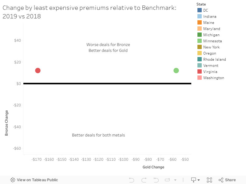
It varies a lot. Some cities like Burlington Vermont will see Gold and Bronze plans get at least $100 cheaper relative to the benchmark in 2019 than 2018. We should expect significant increases in subsidized enrollment as Vermont will be Silver Switching this year instead of doing nothing like they did in 2018.
Richmond, Virginia will see the relative prices of Bronze plans increase slightly while the least expensive Gold plans will get far cheaper. This makes the unlikely assumption that Medicaid expansion will not alter final pricing.
At the same time, subsidized folks who are not buying the benchmark plan will be slightly worse off as the least expensive Bronze and Gold plans have wider premium spreads this year than they did last year.
The important take-away is that the ACA is a county by county story with very idiosyncratic premium shocks built into the subsidy structure.
Yarrow
Matter of fact sentences like this just highlight how convoluted and complicated our health insurance system is in this country. From a moral standpoint it is just wrong that one county and another county can have vastly different health insurance options available to them.
The Other Chuck
@David: This blog is probably the most informative resource out there on the actual facts of the healthcare business, and we all owe you a great deal of thanks for that.
On that note: I really didn’t grok the graph for quite some time, specifically how the axes correlate, and even then I’m still not getting the conclusory point. Might I recommend some Edward Tufte on your reading list? I only bring it up because I would have no idea how to actually apply such guidelines, but I suspect you would, and a really compelling graph/chart can make a world of difference in getting a point across.
.
MisterForkbeard
I admit that these summary sentences do a lot for me on these posts. I usually read these and THEN go back and read the rest of the article, as it helps me put the rest of the article in better context.
Another Scott
@The Other Chuck: (Sorry if you already know this – ) You need to hover your mouse over the circles on the graph. (Dunno how it would work on a phone or tablet.) It’s a scatter plot – there isn’t a functional relationship between the axes, but rather the axes show the range of changes of the Gold (x-axis) and Bonze (y-axis) offerings. The data circles are all over the place, so one has to look at the details in one’s particular locality.
HTH a little.
Cheers,
Scott.
(Who agrees that Tufte is great, but dunno what he would say about interactive graphs like these.)
David Anderson
@The Other Chuck: I agree Tufte is wonderful but this was a quick and dirty for me to organize my thoughts more than anything else. I’ve cleaned it up some to get rid of some of the extra junk.