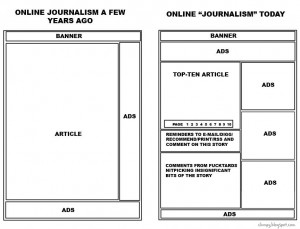
This is about right (click to make bigger). I got it here, but that doesn’t look like the original source.
Reader Interactions
21Comments
Comments are closed.
by $8 blue check mistermix| 21 Comments
This post is in: Our Failed Media Experiment

This is about right (click to make bigger). I got it here, but that doesn’t look like the original source.
Comments are closed.

Dennis SGMM
Ariana Huffington called: she wants her PowerPoint slide back.
toro toro
Embiggen. Click to *embiggen*. Aren’t you aware of the relevant internet tradition?
Odie Hugh Manatee
@Dennis SGMM:
If you take the image on the right, flip it and then superimpose it over the original and you have the HuffPo business plan.
Thanks to AdBlock, FlashBlock, NoScript and SeaMonkey, that crap is a thing of the past.
Amir_Khalid
On what evidence is this graphic based, other than Jamie Keiles’ gut feeling?
If accurate, it doesn’t look so bad to me. More screen area taken up by advertising could be a sign that online media outlets are learning how to attract enough ads, that online journalism is being figured out as a business. After all, the alternative to ads is paywalls.
I have absolutely no complaints with news sites taking advantage of online interactivity to invite linking, Digging, emailing stories etc. Like the Boss said: “Use it, Rosie, that’s what it’s there for!”
As to the
oftenusually unenlightening reader comments you see after any news story on sites that invite them, the responsibility lies with the commenters themselves. Comments can make the site worthwhile, as they do for Balloon Juice, and you got to take the bad (e.g. … on second thought, I won’t name any names) with the good.Comments shouldn’t overshadow the news stories themselves. But they can be a useful indication of the level of reader awareness/interest/knowledge in a story. In any case, the online reader is still free to skip the comments after the story.
Jester
Um, isn’t nitpicking at articles one of the foundations of blogging? It’s a difference in degree, not in kind. Just like this comment ;P
Suck It Up!
oh man, that’s hilarious. and so true.
Jim C
Wouldn’t it be likely that the originator is the signed credit at the bottom: clumpy.blogspot.com?
(unless that is Jamie Keiles)
Amir_Khalid
@Jim C: I clicked on that link, and all it led to was the graphic.
Joey Maloney
@Amir_Khalid: Wow, no question about which segment of that diagram this post belongs in.
ThresherK
One thing missing: The “A few years ago” had a Print or Single-page button. It may be found in a few archaic sites “Today” alongside the “Page 2-3-4-5…”.
NobodySpecial
The picture’s wrong, by the way, the ads are much too large.
I realize that was an insignificant part of the story, but I’m too much of a fucktard not to nitpick it.
Malraux
The other element to remember about many contemporary ads is how visually active they can be. Movement, flashing, or even some guy blabbing at you. Or even worse, the modern popup which takes over the whole screen for a bit.
Jane2
What does web layout have to do with the quality of content? This is like comparing web and mobile layouts…both are for specific devices, but neither has any effect whatsoever on the quality or amount of the content, which is still up to the news source.
Reggie Syriac
This may be the source:
http://www.hipsterrunoff.com/2010/11/negrofication-pitchfork-and-death-white-mans-indie.html
Mouse Tolliver
All this means is that online publications have started following the long-standing deadtree business model: One third of your publication should be content. The other two thirds should be advertising.
Comrade Kevin
The image does, in fact, have the original source embedded in it, if you had actually looked at it.
Martin
Well, advertising as a revenue stream is effectively dead. Until the newspapers find a way to monetize their content without involving ads and paper delivery, they’re going to die.
I think Rupert might actually solve this one, though. I’m going to go out on a limb and say that it’s going to suck – rapidly descending down the gossip/opinion rabbit hole that Rupert always manages to dive down, but the model should be viable if the content is good so the followers-on could make a run of it.
That Apple is the center of all of this isn’t the fault of their dominance in tablet computing, its that nobody else has bothered to make non-shitty online payment mechanisms. A cheap publication needs a truly no-hassle payment mechanism, and only Apple has that.
Nutella
The diagram left out the biggest section of online news: Comments from fucktards ranting about issues unrelated to the story.
@martin: A way to handle micropayments easily is crucial, I agree, but I don’t know if this new online newspaper with no links to or from anything is going to sell all that well. The no links idea seems to be bringing over one of the biggest disadvantages of paper media.
Kyle
I hatehatehate articles where you have to click to the next page for every fucking two sentences, especially on bog-slow pages where a new set of ads takes ten seconds to load every time.
And could they at least put in a nice big “next page” button, instead of having to squint through a series of numbers to determine which page you are on in order to click the next tiny number?
Too many offenders to list.
Matthew
@Amir_Khalid:
Just the opposite: online ads are so ineffective, and hence so dirt-cheap, that you need a barrelful of them to make even a little money.
Kittehs to the rescue
Expanded version: http://www.makeuseof.com/tech-fun/the-evolution-of-online-journalism/
Original: http://clumpy.blogspot.com/2009/06/eh-ill-get-another-fifteen-minutes-of.html