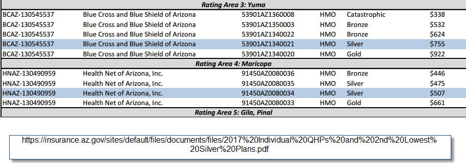
Using the 2017 QHP Landscape PUF file , I was able to build a map of the Silver Gap and Silver Spams regions of that are served by Healthcare.gov
Dark red is a small gap and dark green is a large gap. The smallest gap is $.03 while the largest gap is in western Tennessee at about $97.
The intermediate processed data is available on a Google Sheet. The grayed out counties in HC.gov are the counties with only a single Silver plan. Given the way I set up my map, they were not showing anything. If I was not doing this as I was relaxing after putting the kids to bed, I would do this right, but for quick and dirty, a single Silver county is effectively a Silver Spam county. updated to show single Silver counties.
On first glance, the spreads are massive. The smallest spread in a multiple Silver county is three cents. The largest spread is just under $100. In non-HC.gov states, there are larger spreads in California.
Tennessee, Montana and, central Illinois, southeast Pennsylvania, north Texas and a few other slots seem to benefit from significant Silver Gaps of at least $40. I am very curious as to what is happening in Tennessee as almost the entire state is a massive Silver Gap strategy.
Kansas, Utah, South Carolina, Maine, New Hampshire are entirely Silver Spammed. Significant chunks of South Carolina (and south Jersey) have counties where the spread is under $1.00 between the benchmark and the least expensive Silver plans.
If anyone wants the data, please grab it and see what fun things you can do with it.
Definition update: Silver Gap is when the price spread between the cheapest Silver in a county and the benchmark, second lowest priced Silver is wide. This gives the subsidized buyers a great deal on the #1 Silver.
Silver spam is when the price spread between the #1 and #2 is tiny. The buyers of the #1 Silver do not get a meaningfully better deal.