
Martin has been kind enough to put together a Guest Post on Data Modeling in the Epidemic. Part 1 was posted at approximate 2:30 pm on Wednesday. This is Part 2.
Once again, Martin is standing by in case we have questions.
Take it away, Martin!
Questions on Data Modeling in the Epidemic: Part 2
So, how do we know if containment is working and for how long do we need to do this?
We can answer this! Well, we can get close, with a few caveats, because we can look at what happened in China, and we can do a little bit to confirm that model with what’s happening in Italy a bit ahead of us. So how do we build it?
Well, what do we have to work with, and what do we need to know? We have a few data elements – confirmed cases, fatalities, recoveries. And we have time. We know this data for each day. We know this for the whole world, for different countries, and for different cities and states. Now, the experts have a whole bunch of other data, hospitaliation, ICU cases, intubated cases, tests administered but waiting on results, etc. and all in infinitely more detail than we have.
Confirmed cases is kind of garbage. I’ve been largely ignoring it because I don’t know if it’s telling me reproduction rate R0 or testing rate. It may get reliable, but I’m not counting on it.
The most accurate bit of data is likely fatalities. Unlike determining if someone is infected or not, we’re really good at determining if someone is dead or not. And if they are dead, we can test if they’re infected, so we can probably rely at this point on that being a pretty reliable number. Time can be a bit more uncertain than you might think because when data is collected and reported in a human administrative dependent process (as opposed to an automated weather station that does things on precise and unwavering schedules) you have problems of people going to the dentist and not getting their data in until the next day. So, we’ll expect this to be a bit noisy from day to day.
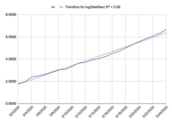
Now, because we’re at the start of an epidemic, where there’s almost nothing holding spread back like herd immunity, we can probably expect to see something like a perfect exponential curve. A model for infected is more complicated because people recover. Nobody recovers in our model. And when we plot that out, that’s exactly what we get. People aren’t very good at intuiting variation from an exponential curve, or even extrapolating on an exponential curve, but if you take the logarithm of your data, you wind up with a straight line, and we’re pretty good at intuiting a linear function. Below is a plot of the log of our fatality data for the US, and that’s a pretty darn straight line. I suspect that recent uptick in the slope is due to NYC dominating the national data and having a higher R0.
If you want to play along at home, the fatality rate for the US is approximated by e0.273t where t is days since the first fatality (Feb 29).
So we have a well behaved exponential function, and that doesn’t tell us when things will change, but it does give us a sense of urgency. You can look forward and see projected fatalities that make you pucker and decide let’s make sure we don’t get there and then work backward.
Understand, we’re building a very simplified model here. Our goal isn’t to give us any real long-term predictive value of how many people may contract this, or how many people will die. Our goal is to give a good approximation of the worst case sceniario for early in this epidemic and then look for when the model breaks on the assumption that our actions will break the model before other normal factors like herd immunity does. The model gives us a sense that if we want to keep fatalities below a certain number (and we’re assuming that number is relatively small) then we need to act before a certain date. In terms of actual fatalities, the model is probably accurate to about an order of magnitude, and that’s all we’re looking for. Are we looking at thousands or tens of thousands or hundreds of thousands of fatalities? What should I emotionally try to prepare myself for, and how loudly should I scream at my governor to shut my state down now, even if things may not seem too bad locally.
What does China tell us?
China gives us some good data to work from. They did a bunch of minor things just as the US did, but they locked down Wuhan on Jan 23, and all other urban areas the next day. Jan 23 is our day 0. And China saw a nice exponential curve as well – it was a little different in magnitude (the slope of the log is different) so it might grow a bit faster or a bit slower but either way it grows incredibly fast.
The first sign their lockdown was working was on Feb 5 (day 13). That was the first day that new cases fell, and they generally continued to fall after that. That doesn’t mean that people stopped getting sick on Feb 5, it means they stopped getting sick on Jan 24, but we couldn’t measure it until 13 days later (give or take a few days, plus a few days to confirm that it’s a trend and not just an outlier). So, if we are modeling infections and we want to know if a given action had an effect, measure any change that occurs around the 13 day mark. That also tells us that any action needs to remain in place for probably around 3 weeks before we get any real sign it is working or not. But this is our inflection point for R0 going from greater than 1 to less than 1.
The next sign came on Feb 13 (day 21), the first indication that the rate of fatalities was halting. Now, the fatalities didn’t immediately fall, but it stopped growing and that’s key. Fatalities per day stayed relatively flat until Feb 24 (day 32) when it started to consistently fall. Then on March 9 (day 46) the number of daily fatalities fell to about the level of day 0.
So, what does this tell us? Well, look at that date where the fatality projection makes you pucker, go back 21 days and make sure your most aggressive mitigation action is in place by then, because if not, you will hit that number, and you may maintain that daily rate of fatalities for days.
Now, a few caveats here. The 13 day and 21 day numbers are largely a function of the virus, and not the population. Those should be roughly equally true in China as New York City as Montana. If you blow through day 13 (give or take) and have no reduction in infections, then you didn’t dream big enough, need to throw down some much more restrictive actions, and wait another 13 days (give or take).
So, does Italy validate that? Possibly. Italy quarantined their first area on Feb 23 and then did national quarantines on March 8/9. We should see some slowing of new cases on March 7 (day 13 for the smaller area) but without an infection model we can’t see that, and a larger reduction around March 21/22 (day 13), and we did see that on March 22. We should also see some sign of reduction in the fatality numbers around March 15 (day 21 for the smaller area), and we do. Their numbers are still climbing, because that wasn’t the national lockdown, but it definitely slowed right around that date. The next and larger data point should come around March 29/30.
The dates after that are largely a function of the population, the effectiveness of the actions taken on day 0 and the compliance of the population. The 11 day long plateau in the fatality rate that China saw might be shorter or longer here. The 14 days to reduce from the plateau back to day 0 might be shorter or longer here.
My assumption is everything will be longer in the US than China. Despite Wuhans high population density, China has an unprecedented ability to control their population and an unusually high level of compliance by the public. The US is struggling with compliance, and has very little control. That doesn’t mean it won’t work, it just means we probably won’t see that nice sharp inflection that China had. It’ll probably be messier and slower, possibly much slower. Italy should give us a little more insight in how much things can vary. Their lockdown was national, but Italians are notoriously defiant of government guidelines, so they should look closer to US efforts.
Days 0 in the US:
Bay Area: March 16
California: March 19
New Jersey: March 21
NYC: March 22
Bay area is already showing some evidence of improvement, presumably from their work from home, public gathering orders back in early March. We’d expect to see real new case declines on or just after March 29. CA as a whole, April 2, New Jersey April 4, NYC April 5. We’d expect to see fatality growth halt in the Bay Area on or after April 7, CA April 10, NJ April 12, NYC April 13.
If nothing else, we’re trying to establish the importance of acting quickly because once fatalities starts to go, it goes fast. And while we’re in this state just waiting for something to happen, roughly when we can expect to see results and where to look.
Additional information added at 3pm, based on new information and an additional model:
So, I wrote this yesterday, and some new information has come out, and some new models have been made.
Specifically, I built a model of NY. To start, it’s a bad model since there are only 13 days of fatality data. A model built on 13 datapoint is going to suck. It can change wildly with just one more data point. To give an example, a model built of Washington State built after 13 days would look apocalyptic because all of the data was dominated by a single nursing home, that you would expect to have a vastly higher mortality rate than the general population. The mode suggests a trend that simply can’t hold, mainly because everyone in the nursing home was pretty much accounted for. You can’t grow fatalities in a 150 person facility above 150, but the model is too primitive to reflect that. So that’s just a limitation we need to keep in mind. And sure enough, after some more data was collected, a more reasonable and less apocalyptic trend developed. We just had to be aware that there were a lot of unknowns and wait to see how things shook out. That how this kind of field data modeling works. It’s messy and limited but can help to tell us where to look or can change the urgency of a decision.
As to New York, their numbers look pretty apocalyptic right now. But New York isn’t getting the kind of detailed reporting that Washington did. For all we know, most of these fatalities came out of a single project in the city and once it tears through the few thousand people that live there, the underlying general population trend will emerge. I’m hoping that’s the case, but we just have to wait. I want my model to break, because that provides us with a new bit of information, and we can then go and try and figure out why it broke. We have a theory for when lockdowns will break the model, but there can be other causes as well – as happened in Washington state. That’s not a bad thing. In fact, that’s sort of the point.
Another key bit of information is out of Italy that they may be significantly underreporting their fatalities. That was a concern of mine. Any human collected dataset has to deal with this stuff, so you just asterisk everything. The testing data is kind of garbage because everyone has different access to tests, and different criteria for testing, but it also changes for a given location. When the 10th person this hour walks in presenting the same set of Covid symptoms, do you really take the time to give the test, or do you just get them in a bed ASAP. Of course testing is good information, but you may no longer feel you have time to do it. So testing data just gets that much more unreliable. Same goes for fatalities. When 13 people a day are dying in your hospital, the effort you put into determining cause of death is going to change. Do you run the Covid test so you can list that as cause of death, or do you just put down what you know, respiratory failure, and move on.
Italy’s fatality data seemed to fall off faster than I expected. I attributed that to the smaller quarantine in northern Italy having an oversized effect on the data (they quarantined for a reason, so it’s not unreasonable to assume they’d dominate the data) but now it’s looking like it may (also?) be a lack of attribution of fatalities to the disease. We just have to deal with that. China’s data saw a similar pattern, possibly for a similar reason. Maybe fatalities don’t drop off at day 21, hospitals simply get too overwhelmed to count them accurately, and the real dropoff is day 32. More likely it would be somewhere in between. So, we’ll look more closely at Italy’s data as it continues to come in and see if we can figure that out. California may provide a better data point. We locked down earlier than Italy in terms of number of fatalities, so I don’t expect CA will get quite as overwhelmed as Italy. That should give us somewhat more consistent data.
Martin Guest Post: Questions on Data Modeling in the Epidemic: Part 2Post + Comments (68)