I’ve been looking at Evergreen Health’s (a Maryland Co-op) financials as they have been raising a stink about risk adjustment. One of their pages from their March 31, 2016 quarterly filing stood out to me as it illustrates the differences between the populations covered by Exchange/qualified health plans and the population covered by employer sponsored coverage. This page is the membership and utilization summary with my notations.
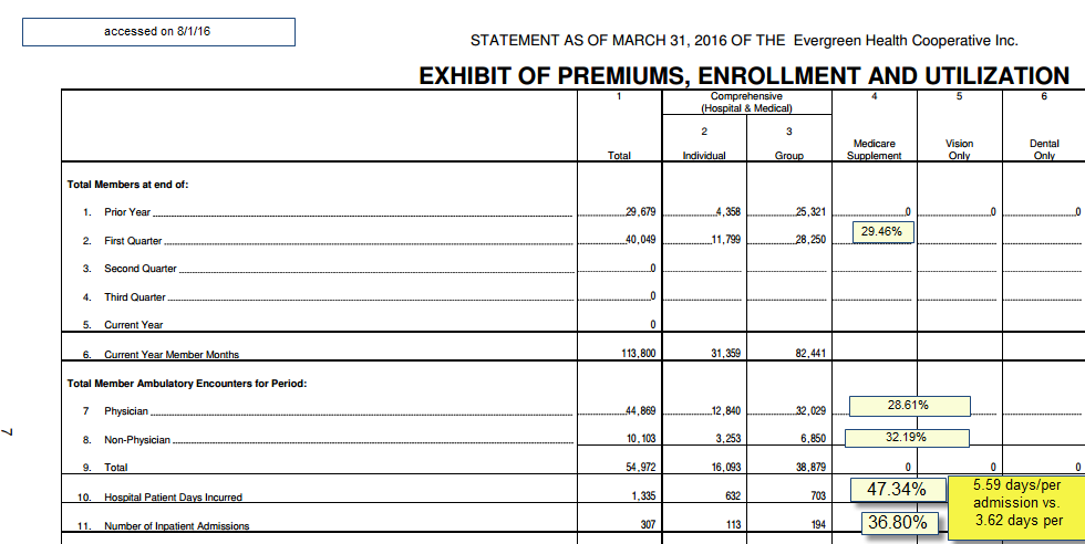
There are a couple of interesting to me things here. The first thing to note is that the individual market makes up 29.46% of the total members and 27.5% of the member months. This means the individual market has a lot of people starting in February and March compared to the group market. If the individual market is identical in utilization patterns to the group health market, we should see no deviation from the population share of the utilization by segment. We don’t see that. At a higher level of sophistication, we would expect to see age/risk adjusted equivalence. We don’t have that data.
We see that people on individual policies go to their physicians slightly more than expected. Non-physician utilization is a little bit high. This combination of 5% higher than population expected physician claims and 10% higher non-physician claims could be okay. These services are relatively cheap from the insurer’s point of view. There sometimes is a trade-off between more intensive out patient utilization and lower hospital usage. And under most plausible scenarios, that will lead to lower total costs. That is not the story we are seeing.
The thing that leaps out to me is the hospital inpatient days. The individual market is slightly more than a quarter of member months. They have slightly less than half the hospital days. There are 20 hospital days per 1,000 member months on the individual side of the ledger. On the group side there are 8.5 hospital days per 1,000 member months. The big driver of this disparity is not admissions (although that is part of the equation) but length of stay. The average length of stay for an individual on Exchange is 54% higher than the average length of admission for someone on a group policy.
Since these members are covered by the same insurer using the same networks, I am assuming that they are receiving roughly similar care coordination and medical/utilization management strategies. I am assuming those are a wash. Instead, we are most likely seeing the clearest indicator that the Individual market members are much sicker and needing much higher levels of care than group members.
So what are some of the take-aways here?
First, any plan that built their pricing on commercial utilization patterns is in trouble. We’ve talked about how employment is a soft screen for health status before. This is a very clear example of how that actually plays out. Secondly, hospital utilization is very concentrated. Even in the Individual market with 113 admissions, it is less than 1% of the total membership that gets admitted in a quarter (I’m betting there are fewer than 113 unique individuals admitted as there is almost always a frequent flyer). Yet the difference between individual and group market utilization of hospital admissions drives very different fiscal outcomes for the insurer. And notably, this quarter is probably the best quarter as the cost-sharing limits are being reached by more and more Evergreen individual market members every month so their marginal cost of care goes to zero.
I’m not picking on Evergreen. I am just using their data as I was looking at it for other reasons and this just was a great example of a couple things that have been mentioned in passing.
Health differentials between QHP and ESI universesPost + Comments (8)